Trusted by Market Leaders in Education, Travel, Finance and E-commerce since 2007


We put excellence, value and quality above all - and it shows


A Technology Partnership That Goes Beyond Code

“Arbisoft has been my most trusted technology partner for now over 15 years. Arbisoft has very unique methods of recruiting and training, and the results demonstrate that. They have great teams, great positive attitudes and great communication.”


Monitoring and Observability in Cloud Environments: Tools, Techniques, and Real-World Impact


Cloud systems are powerful. They auto-scale. They self-heal. They span regions. They run across containers, serverless functions, managed databases, CDNs, and third-party APIs.
But when something breaks? It rarely breaks in a simple way.
Latency spikes without an obvious reason. A single downstream service starts throttling requests. A deployment introduces subtle cascading failures. Users see spinning wheels while dashboards still look “mostly green.”
This is where the difference between monitoring and observability becomes the difference between a 5-minute recovery and a 2-hour outage.
Let’s break this down properly: tools, techniques, dashboards, and real-world incidents that show why this matters.
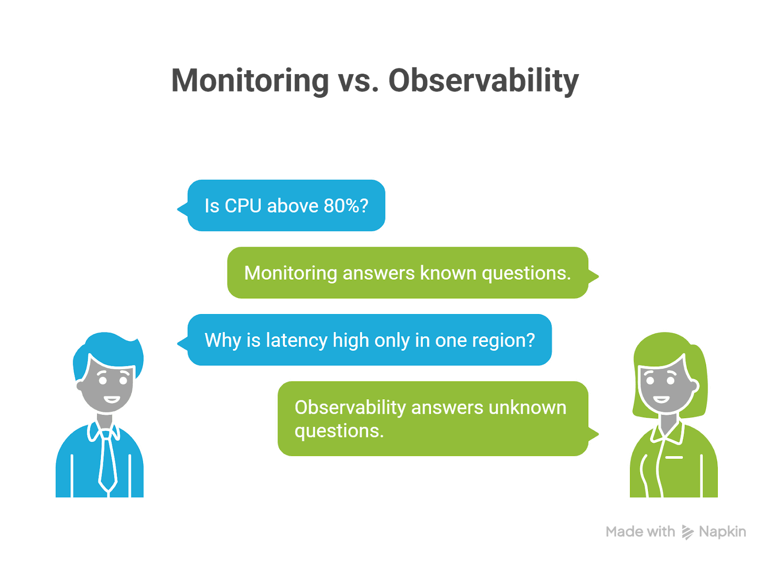
Monitoring vs Observability (The Practical Difference)
Monitoring
Monitoring answers known questions:
- Is CPU above 80%?
- Are 5xx errors above the threshold?
- Is memory almost full?
- Is the request latency above 500 ms?
You define metrics. You set thresholds. You get alerts. Monitoring is reactive, it tells you something is wrong.
Observability
Observability answers unknown questions:
- Why is latency high only in one region?
- Why are retries increasing?
- Which service started rate limiting?
- What changed right before errors began?
Observability allows you to explore and investigate without deploying new instrumentation. Monitoring tells you there’s smoke. Observability helps you find the fire.
The Three Pillars of Cloud Observability
Modern cloud environments rely on three primary telemetry signals:
1. Metrics – The Health Signals
Time-series numeric data:
- Request rate
- Error rate
- Latency percentiles (P95/P99)
- CPU, memory, disk
- Queue depth
Common tools:
- Prometheus
- Grafana
- AWS CloudWatch
- Azure Monitor
- Google Cloud Monitoring
Metrics are fast and cheap. They are your early warning system.
2. Logs – The Narrative
Logs explain what happened.
Example:
Checkout failed – downstream catalog returned 429 (rate limit)
Best practice:
Use structured logs (JSON)
Always include:
- service name
- environment
- trace_id
- request_id
- version
Logs become powerful when correlated with traces.
3. Traces – The Full Request Journey
Distributed tracing follows a request across services:
User → API Gateway → Auth → Checkout → Catalog → Payment
Tracing shows:
- Where latency accumulates
- Which dependency failed
- Which span retried excessively
- Where saturation begins
OpenTelemetry has become the standard for generating portable telemetry across ecosystems.
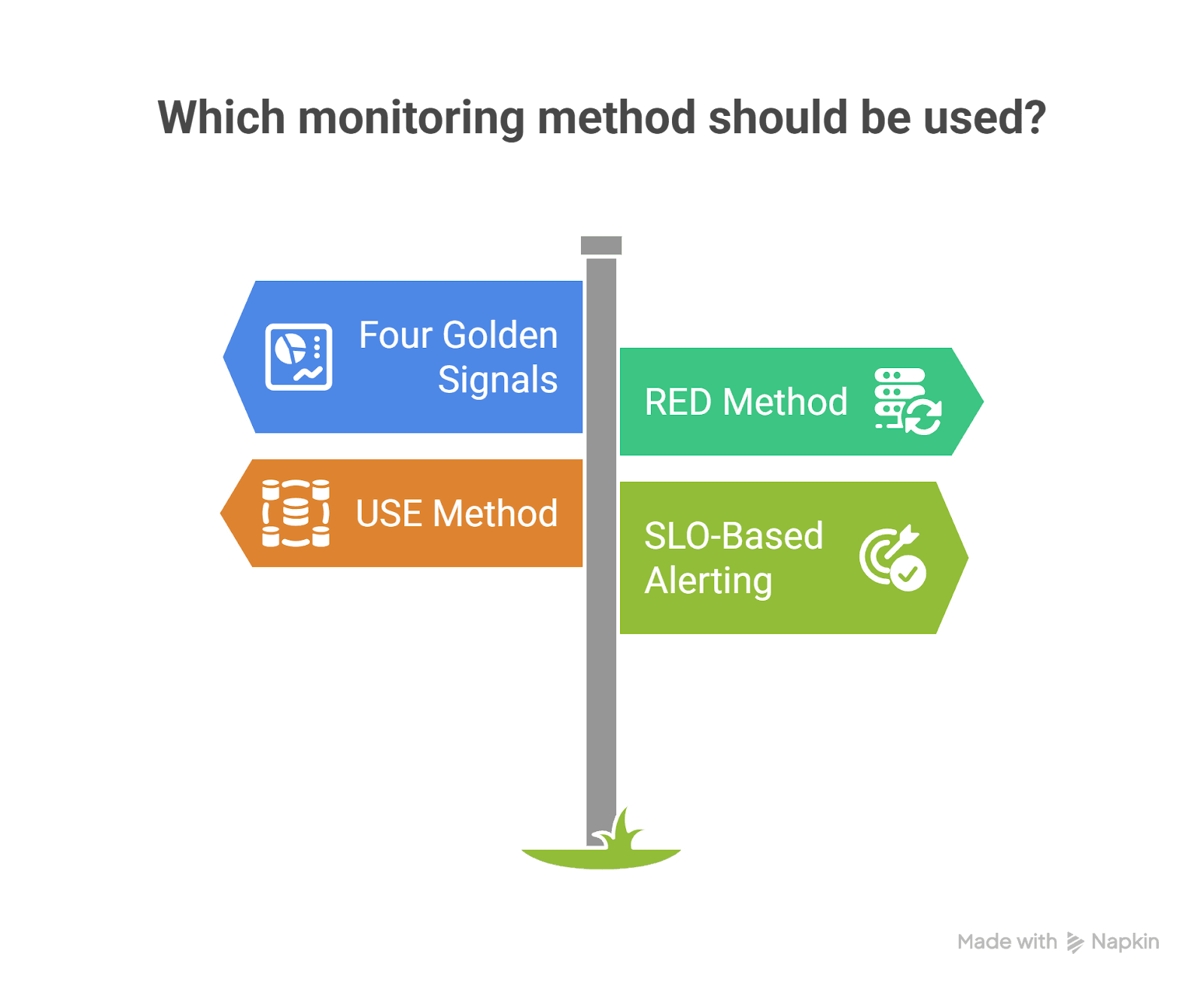
Techniques That Actually Work
Many teams install tools. Few implement them correctly.
Here are proven techniques that separate strong cloud teams from reactive ones.
1. The Four Golden Signals
From SRE practices:
- Latency
- Traffic
- Errors
- Saturation
If you monitor these properly, you detect almost every production issue early.
2. RED Method (For Services)
- Rate
- Errors
- Duration
Perfect for microservices and APIs.
3. USE Method (For Infrastructure)
- Utilization
- Saturation
- Errors
Perfect for Kubernetes nodes, databases, and message brokers.
4. SLO-Based Alerting
Instead of:
“CPU > 85%”
Use:
“Checkout success rate < 99.9% over 5 minutes”
This shifts monitoring from infrastructure-centric to customer-centric.
Real-World Example #1: Cloudflare Outage (November 18, 2025)
What Happened
Cloudflare experienced a network-wide outage where users saw 5xx errors. The issue stemmed from a Bot Management configuration file that doubled in size, exceeding limits and causing proxy failures.
How Monitoring Helped
- Network-wide HTTP 5xx metrics clearly showed error spikes.
- Observability revealed a pattern: failure → partial recovery → failure again.
- Engineers identified that a feature file was regenerating every few minutes.
- They rolled back the file to a known-good version.
- Core traffic was restored within hours.
Key Observability Lessons
- Fleet-wide error metrics are critical.
- Time-series trends help identify repeating failure cycles.
- Observability systems themselves can consume resources during incidents
- (Cloudflare noted that debugging systems increased CPU load).
Impact: Rapid identification of blast radius and faster rollback validation.
Real-World Example #2: Glovo – Cascading Failure During Checkout
Glovo, a global delivery platform, experienced a drop in orders created.
Detection
- Business metrics dashboards showed:
- Orders created dropping
- Checkout error rates increasing
Mitigation
- Engineers traced failures to downstream rate limiting.
- A recent change was rolled back.
- Service was recovered in under five minutes.
Root Cause Analysis Using Traces
Distributed tracing revealed:
- Checkout service called product catalog.
- Catalog returned 429 rate limits.
- Retries caused thread pool exhaustion.
- Database connections became saturated.
- Cascading failure emerged.
Tracing allowed engineers to:
- Compare baseline vs incident traces.
- Filter spans by HTTP status.
- Analyze exemplar traces at the start of the incident.
Impact: Not just recovery, but also prevention of future recurrence.
What Monitoring and Observability Dashboards Look Like
Let’s visualize what good observability dashboards actually include.
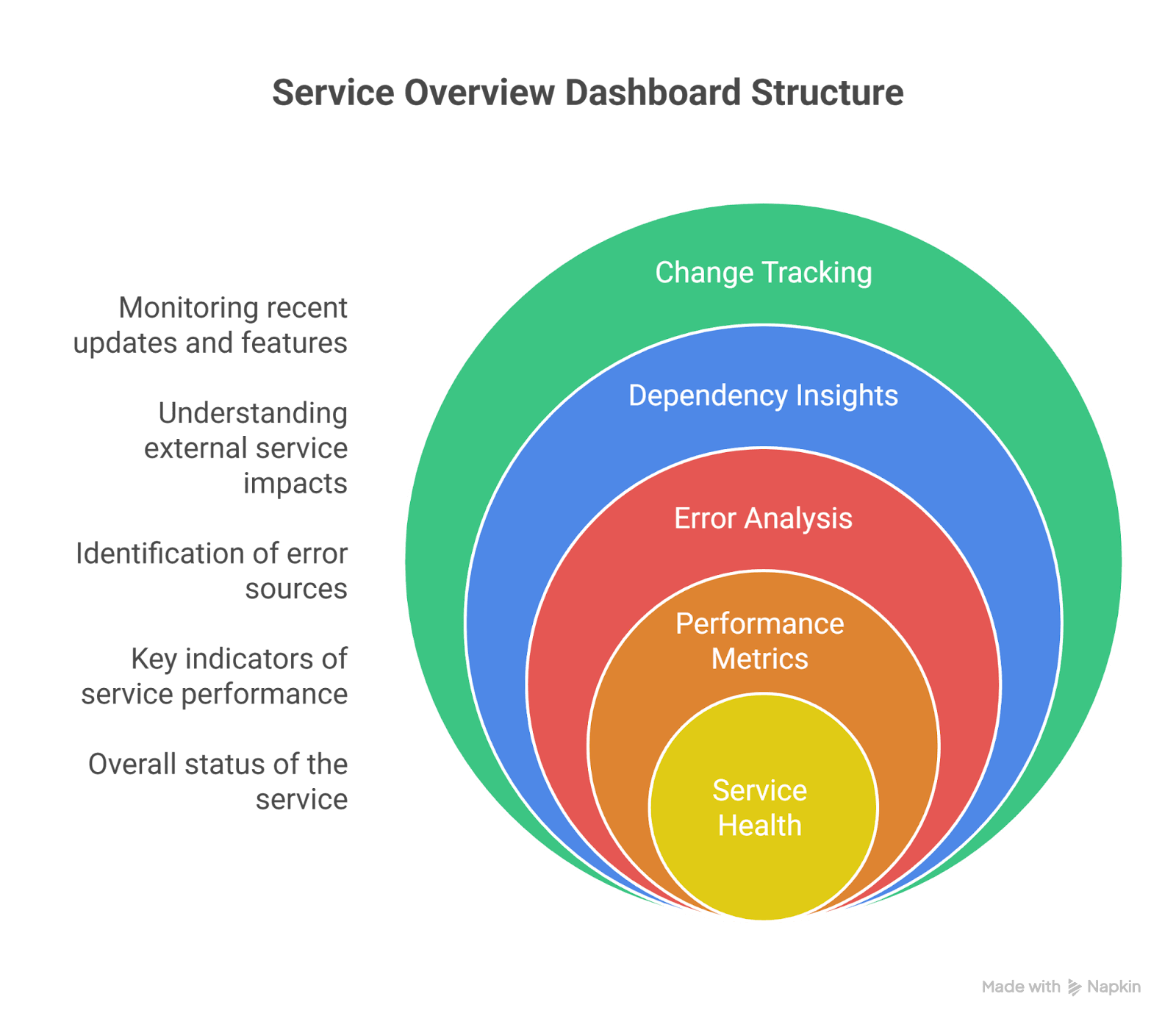
1. Service Overview Dashboard (RED Model)
Top Section:
- Requests/sec
- Error %
- P95 / P99 latency
Middle Section:
- Top failing endpoints
- Top response codes
- Dependency latency breakdown
Bottom Section:
- Recent deployments
- Version distribution
- Feature flag changes
This dashboard answers:
“Is my service healthy right now?”
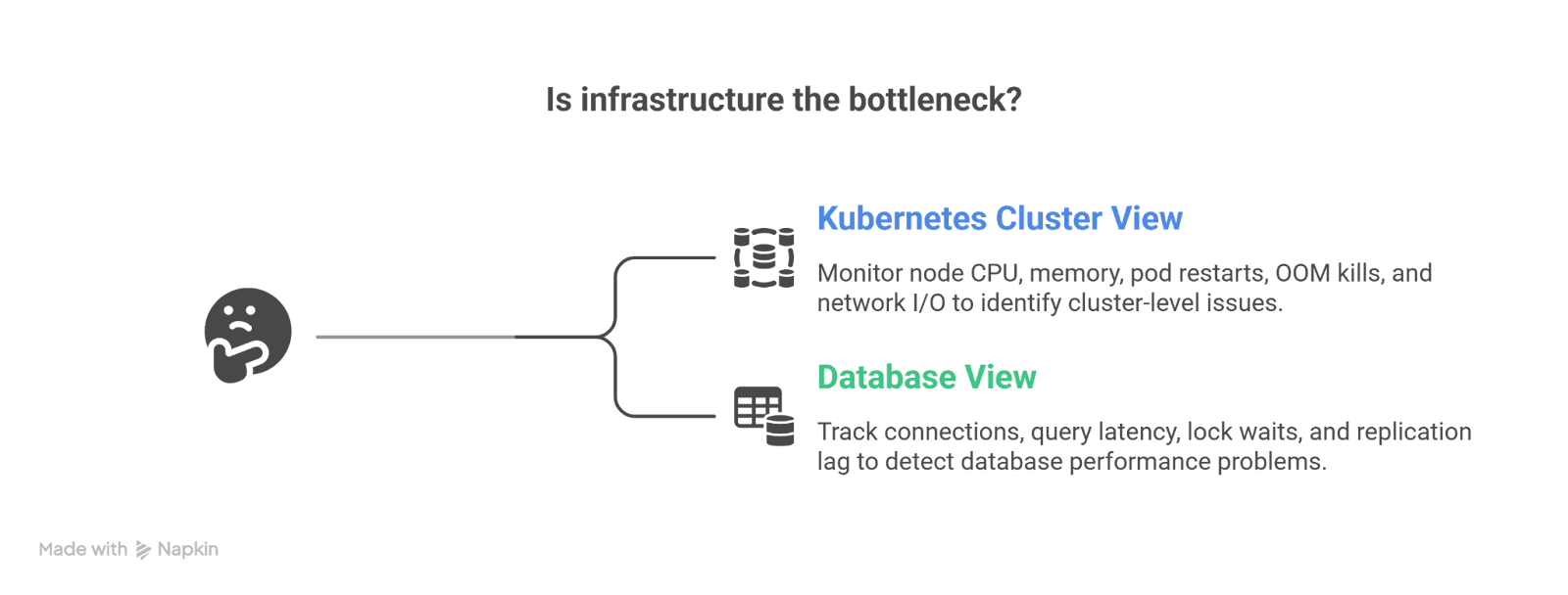
2. Infrastructure Dashboard (USE Model)
Kubernetes Cluster View:
- Node CPU utilization
- Memory saturation
- Pod restarts
- OOM kills
- Network I/O
Database View:
- Connections used
- Query latency
- Lock waits
- Replication lag
This dashboard answers:
“Is infrastructure the bottleneck?”
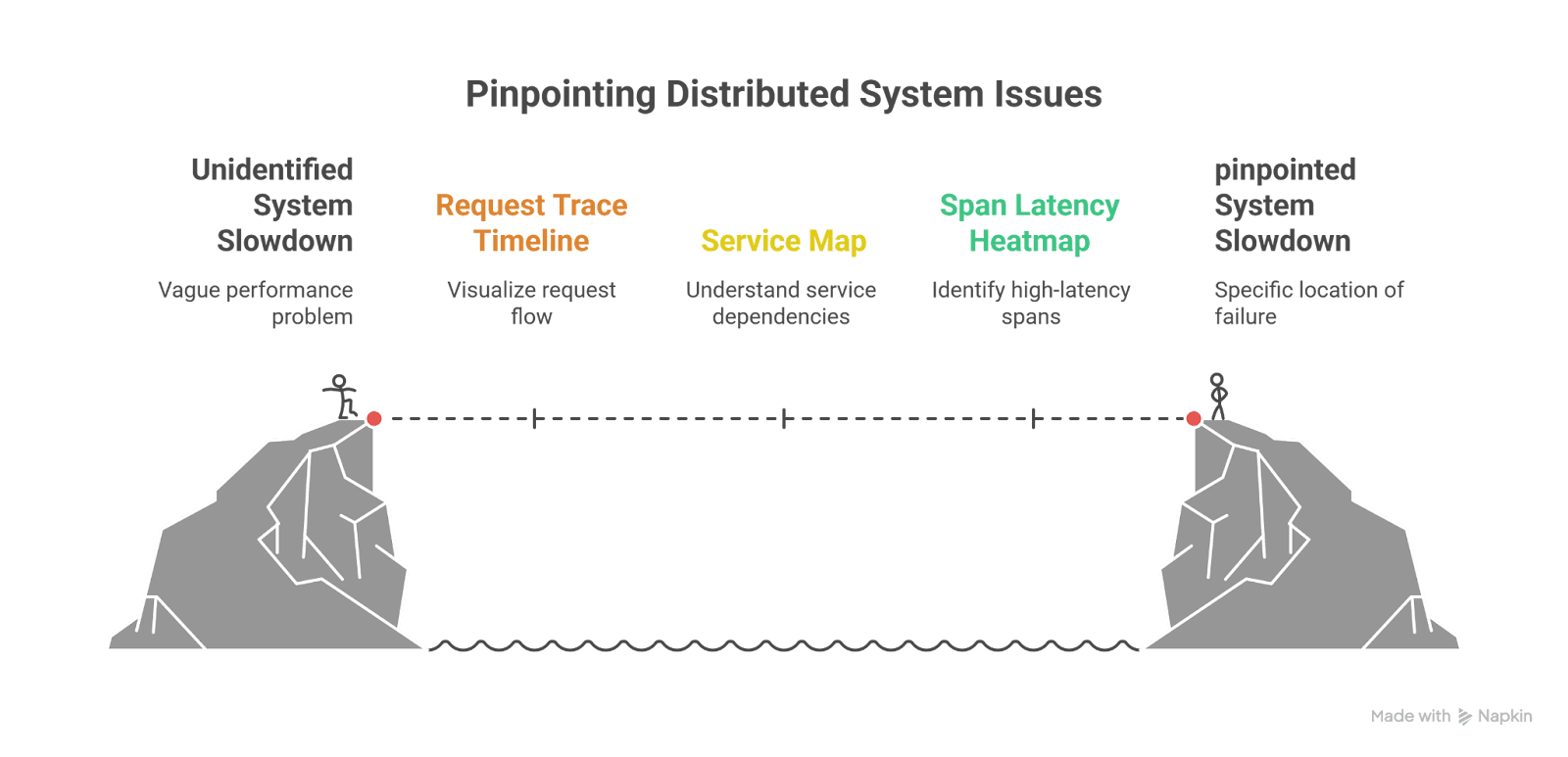
3. Distributed Tracing Dashboard
Key components:
- Request trace timeline (waterfall view)
- Service map (dependency graph)
- Span latency heatmap
- Error span filtering
- Trace comparison (baseline vs incident)
This dashboard answers:
“Where exactly is the slowdown or failure happening?”
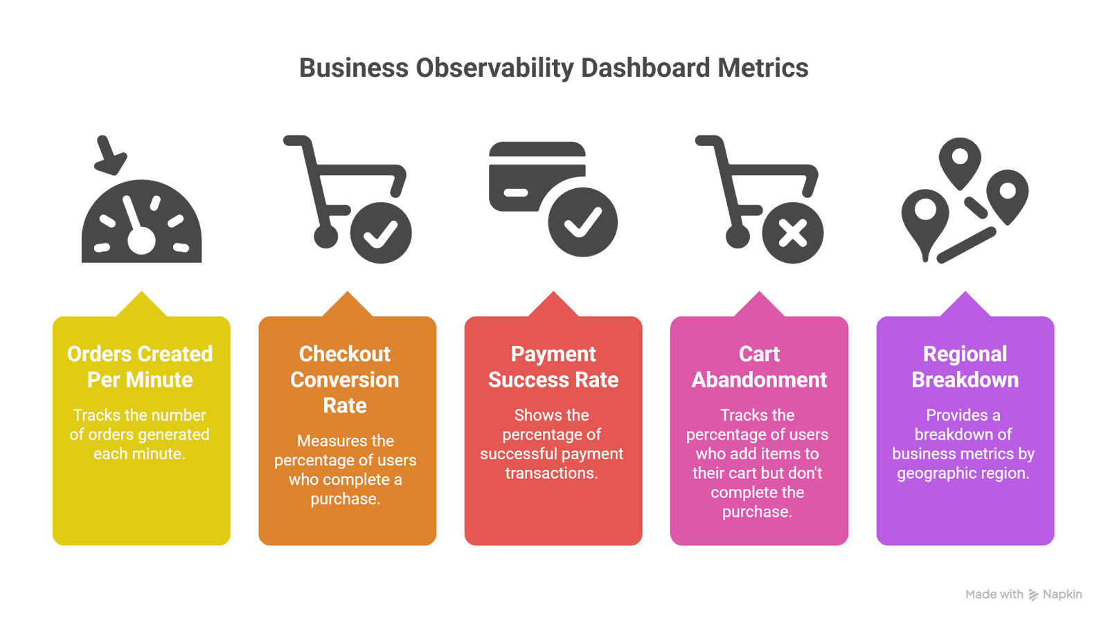
4. Business Observability Dashboard
Often overlooked but critical.
Examples:
- Orders created per minute
- Checkout conversion rate
- Payment success rate
- Cart abandonment
- Regional breakdown
This dashboard answers:
“Are customers impacted?”
In many incidents, business metrics detect problems before technical metrics do.
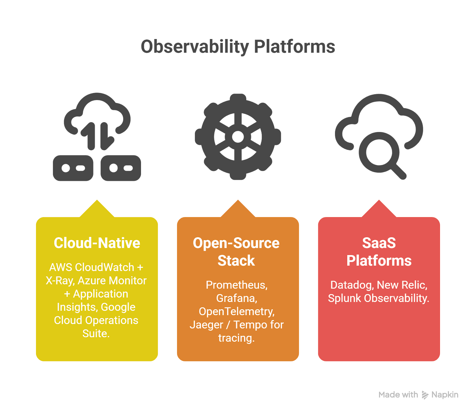
The Modern Tooling Landscape
Cloud-Native
- AWS CloudWatch + X-Ray
- Azure Monitor + Application Insights
- Google Cloud Operations Suite
Open-Source Stack
- Prometheus
- Grafana
- OpenTelemetry
- Jaeger / Tempo for tracing
SaaS Platforms
- Datadog
- New Relic
- Splunk Observability
Most mature teams:
- Instrument with OpenTelemetry
- Export to one or multiple backends
- Maintain vendor flexibility
The Hidden Superpower: Correlation
The most powerful concept in observability is correlation.
Every request should have:
- trace_id
- request_id
- user segment (non-PII)
- environment
- version
This allows:
Metrics → Logs → Traces → Deployment timeline
Without correlation, observability becomes disconnected data. With correlation, incidents become explainable narratives.
Final Thoughts
Cloud systems are inherently complex. Containers spin up and down. Services scale dynamically. Dependencies change. Networks fluctuate. Humans deploy code.
Monitoring helps you detect issues quickly. Observability helps you understand them deeply.
The difference shows during real incidents:
- Cloudflare used fleet-wide monitoring to detect and contain impact.
- Glovo used tracing to understand cascading rate limiting and recover in minutes.
The strongest engineering teams treat observability as a product:
- Designed intentionally
- Standardized across services
- Centered around customer experience
- Continuously improved after every incident
Because at 3:12 AM during an outage, you don’t want more dashboards.
You want clarity. And that’s what true observability delivers.
Just published