

 Add as preferred on Google
The Future of Education Technology in 2027: How AI Is Changing Learning for All AgesRead More

Imagine this: it’s a typical afternoon, you’re at your desk with a steaming cup of tea, facing the daunting task of creating a complex SQL query to make sense of your company’s sales numbers. If that scenario sounds all too familiar, you’re not alone. A lot of folks wrestle with this kind of headache every single day. For many professionals, this is a daily reality that is filled with frustration and a steep learning curve. Databricks saw the struggle and came up with something pretty exciting: Databricks Genie.
In the paragraphs ahead, we’ll take a closer look at how Databricks Genie works, explore real-world scenarios where it shines, and show why it’s genuinely a game-changer, especially if SQL isn't your forte.
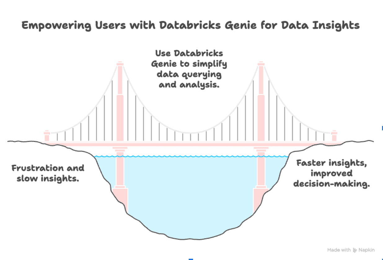
Think of Databricks Genie not as just another analytics tool but as your own on-call data expert. Instead of wrestling with SQL syntax, you simply ask a business question in plain English, and Genie instantly crafts the exact query you need. In other words, Genie handles all the technical heavy lifting so you don’t have to.
Imagine you’re peeking behind the scenes of Databricks Genie’s deceptively simple search bar and discovering a kind of AI orchestra in full swing. Rather than leaning on a single giant language model, Genie quietly enlists a handful of specialized “musicians”, each tuned to a particular task, so that when you type a question in plain English, it can instantly hand you a spot-on, efficient SQL query. Here’s a detailed, step-by-step look at how Genie turns your everyday words into production-ready SQL, complete with real examples to make it all click.
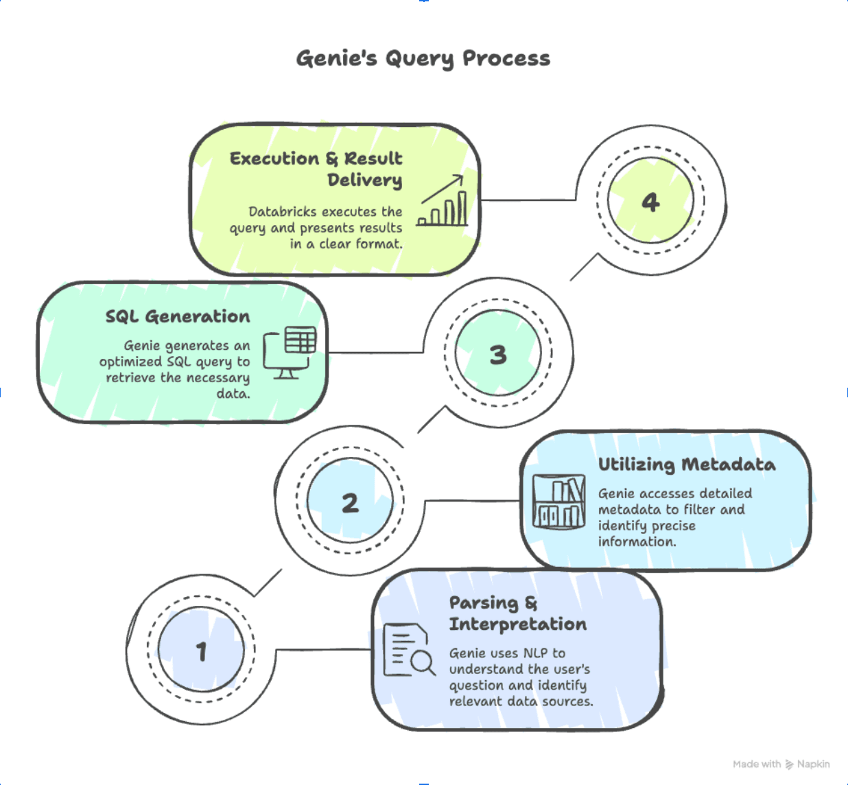
When you type something like, “Show me last quarter’s top five products by revenue,” Genie doesn’t just skim those words. Instead, it:
By the end of this phase, Genie isn’t just aware of your words; it understands the business question behind them. It knows you want a read-only query (a SELECT), grouped by product, filtered to that first quarter of 2025, and capped at five results.
Knowing what you want is only half the battle. Next, Genie needs to figure out where to look. It taps into your Unity Catalog and does the following:
-- Example:
SELECT product_id, SUM(order_total) AS total_rev
FROM sales_transactions
WHERE sale_date BETWEEN '2025-01-01' AND '2025-03-31'
GROUP BY product_id;
Genie can treat that as a template for similar queries.
By scanning all this metadata, Genie builds a mental blueprint: “Okay, I’ll need sales_transactions.order_total for revenue, sales_transactions.sale_date for date filters, and I’ll join that to products.product_name for a friendly label.” It ignores irrelevant tables, no need to drag in customers if you’re only caring about product revenue, and zeroes in on exactly the fields and joins necessary.
Now comes the fun part: composing the actual SQL. With intent and metadata in hand, Genie:
SELECT
  p.product_name,
SUM(st.order_total) AS total_revenueFROM sales_transactions st
JOIN products p
ON st.product_id = p.product_idWHERE
st.sale_date >= '2025-01-01'
AND st.sale_date < '2025-04-01'GROUP BY p.product_name
ORDER BY total_revenue DESC
LIMIT 5;All together, for our example, Genie whips up this query:
SELECT
p.product_name,
SUM(st.order_total) AS total_revenue
FROM sales_transactions st
JOIN products p
  ON st.product_id = p.product_id
WHERE
  st.sale_date >= '2025-01-01'
  AND st.sale_date  < '2025-04-01'
GROUP BY p.product_name
ORDER BY total_revenue DESC
LIMIT 5;Because Genie can optimize for best practices, think partition pruning or avoiding unnecessary SELECT *s, you often end up with something even cleaner and faster than what you might type by hand.
Once Genie finishes drafting that SQL, Databricks takes over:
import matplotlib.pyplot as plt

data = [
  ('Product A', 120000),
  ('Product B', 95000),
  ('Product C', 87000),
  ('Product D', 76000),
  ('Product E', 68000)
]
names, revenues = zip(*data)

plt.bar(names, revenues)
plt.title('Top 5 Products by Revenue (Q1 2025)')
plt.ylabel('Revenue (USD)')
plt.xlabel('Product Name')
plt.xticks(rotation=45)
plt.show()SELECT
r.region_name,
SUM(st.order_total) AS region_revenue
FROM
sales_transactions st
JOIN products p
ON st.product_id = p.product_id
JOIN regions r
ON st.region_id = r.region_id
WHERE
p.product_name = 'Product A'
AND st.sale_date >= '2025-01-01'
AND st.sale_date < '2025-04-01'
GROUP BY
r.region_name
ORDER BY
region_revenue DESC;Within seconds, sometimes less, you go from a plain-English question to a polished SQL query to a clear table (and optional chart). No more wrestling with field names, join conditions, or date math.
The next time you find yourself staring blankly at a SQL editor, remember: with Genie on your side, you’re just a few words away from the insight you need. No fussing over syntax, just plain-English questions that return clear, data-driven answers.
You’re about to introduce Genie to your data, and you want it to rock, no hiccups, no confusion over “I-don’t-understand-this-column.” Think of Genie as a guest chef in your data kitchen: if the pantry is disorganized, the meal will taste off. But when everything is prepped, organized, and labeled, Genie will whip up insights faster than you can say “SQL shortcuts.” Ready to make your data Genie-ready? Let’s dive in!
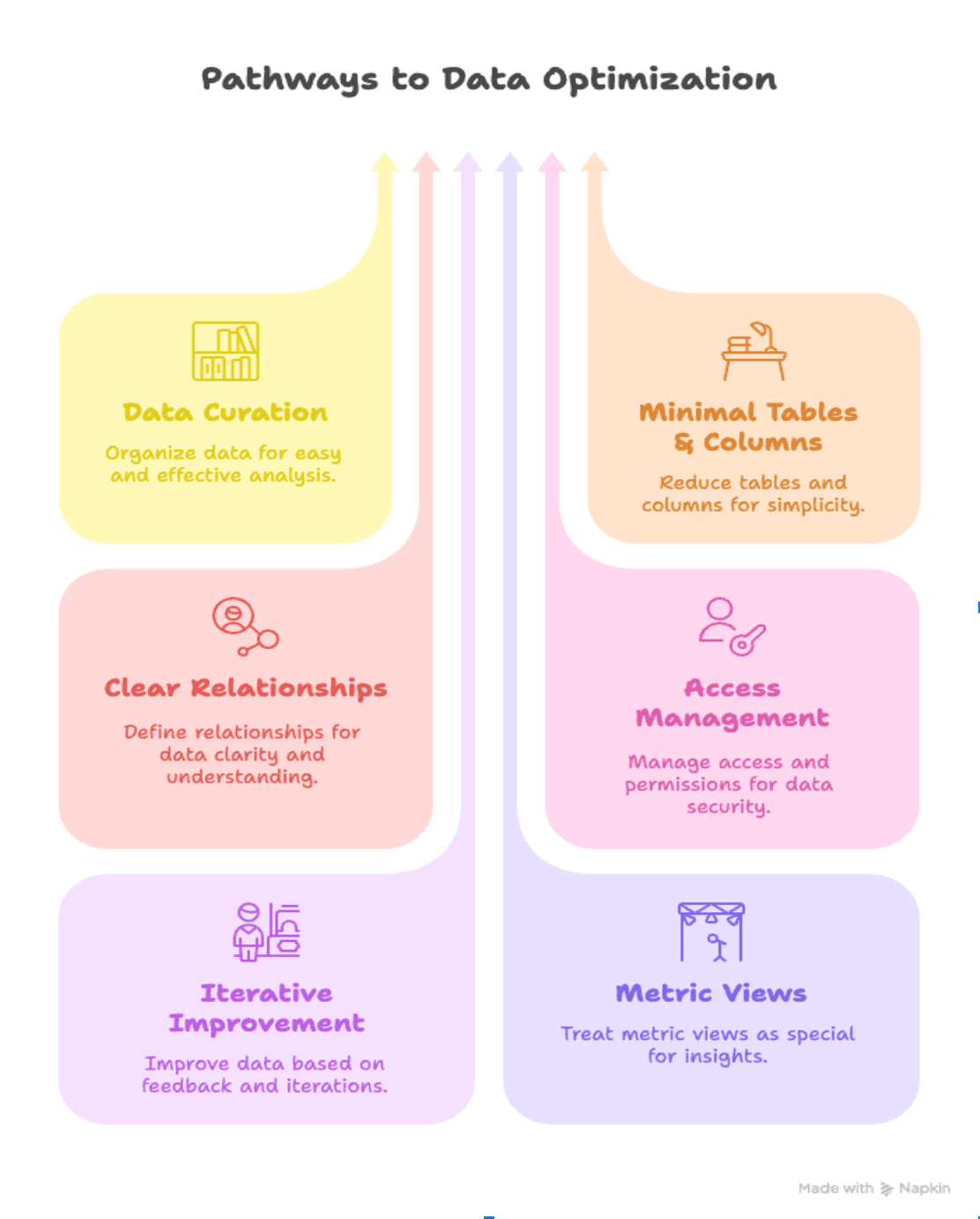
Rather than exposing every column in every table, create lean, purpose-built views. For example, if you only need product_id, sale_date, and order_total for Q1 revenue, build a view like:
CREATE VIEW v_q1_revenue AS
SELECT
  p.product_name,
  st.sale_date,
  st.order_total
FROM sales_transactions st
JOIN products p
  ON st.product_id = p.product_id
WHERE sale_date BETWEEN '2025-01-01' AND '2025-03-31';
With a tidy view, Genie zeroes in on just what matters, avoiding irrelevant data.
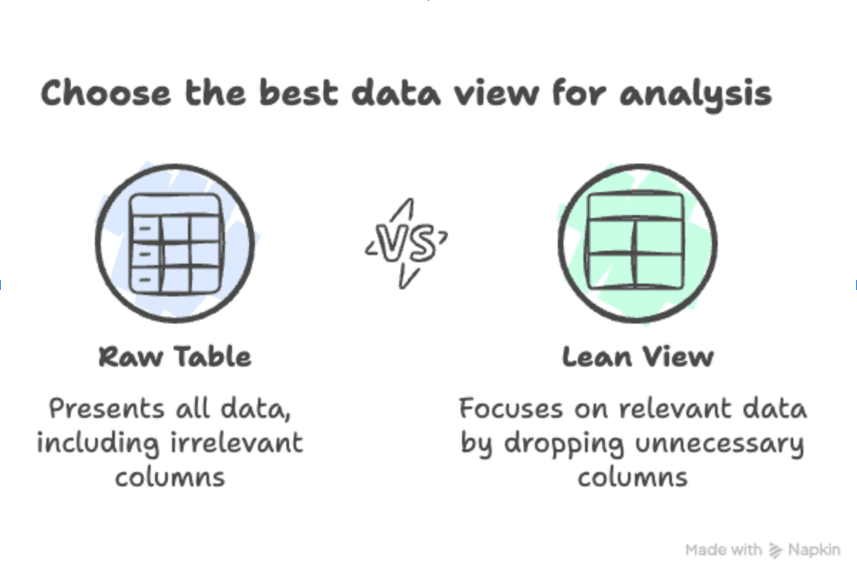
Large tables with dozens of fields can overwhelm Genie (and users). Ask, “Do I really need user_bio or session_duration for a marketing report?” If not, drop them. Partition timestamped data (e.g., by month) so Genie can skip unneeded partitions, like slicing a pizza into neat pieces.
Genie relies heavily on knowing exactly how your tables fit together. Make sure every primary key (PK) and foreign key (FK) is explicitly defined in Unity Catalog. For example, if you have a customers table with customer_id as the primary key, and an orders table that references customer_id as an FK, Genie will instantly grasp how to join those two tables correctly. Clear relationships mean fewer “unknown column” errors and more accurate insights.
Nobody wants Genie to hit a wall because of missing permissions. Use Unity Catalog to set fine-grained access controls; everyone who needs to query data should have SELECT rights on the tables or views they’ll be using. Also, don’t forget to grant CAN USE on the default SQL warehouse (or whatever SQL endpoint your Genie space uses). If a user can’t access the warehouse, Genie can’t run the query, even if everything else is perfectly set up.
Don’t dump your entire data lake on Genie day one. Begin with a single dataset, say, “Q1 Sales.” Let your team ask fun questions and watch what happens. Once everyone trusts Genie’s accuracy, gradually add new tables (e.g., product details, customer segments).
If you’re using metric views, pre-aggregated tables for things like “monthly revenue” or “average session duration”, remember that a single Genie space can only point at one object type at a time. That means if you create a space specifically for metric views, you won’t be able to mix in regular tables or standard views. Plan ahead: decide whether this space’s sole purpose is to serve up metrics, or if you’ll keep it general to accommodate both metrics and raw tables.
Genie learns your lingo from examples. Drop in sample SQL queries like:
-- Example for YoY Growth:
SELECT
  year,
  (SUM(order_total) - LAG(SUM(order_total))
    OVER (ORDER BY year))
    / LAG(SUM(order_total))
    OVER (ORDER BY year) AS yoy_growth
FROM sales_data
GROUP BY year;
Think of these as “contextual hints” that fill in missing business logic or jargon. For instance:
Create a brief cheat sheet inside your Genie space that explains terms (“‘active regions’ means regions.active_flag = true,” etc.). With examples and hints, Genie won’t wander blind.
Once your Genie space is live, listen to how people use it. Are users getting weird or irrelevant results? Maybe something in your data model changed, or an example is out of date. Take note of those hiccups, update your instructions, and roll out fresh examples. Over time, you’ll refine Genie’s “understanding” so it delivers sharper, more accurate answers every time.
Here’s a fun idea! Schedule a short “Genie Jam Session” every few weeks:
Make quick fixes, rename a column, update a join, refine metadata, so Genie learns from real usage and keeps getting sharper.
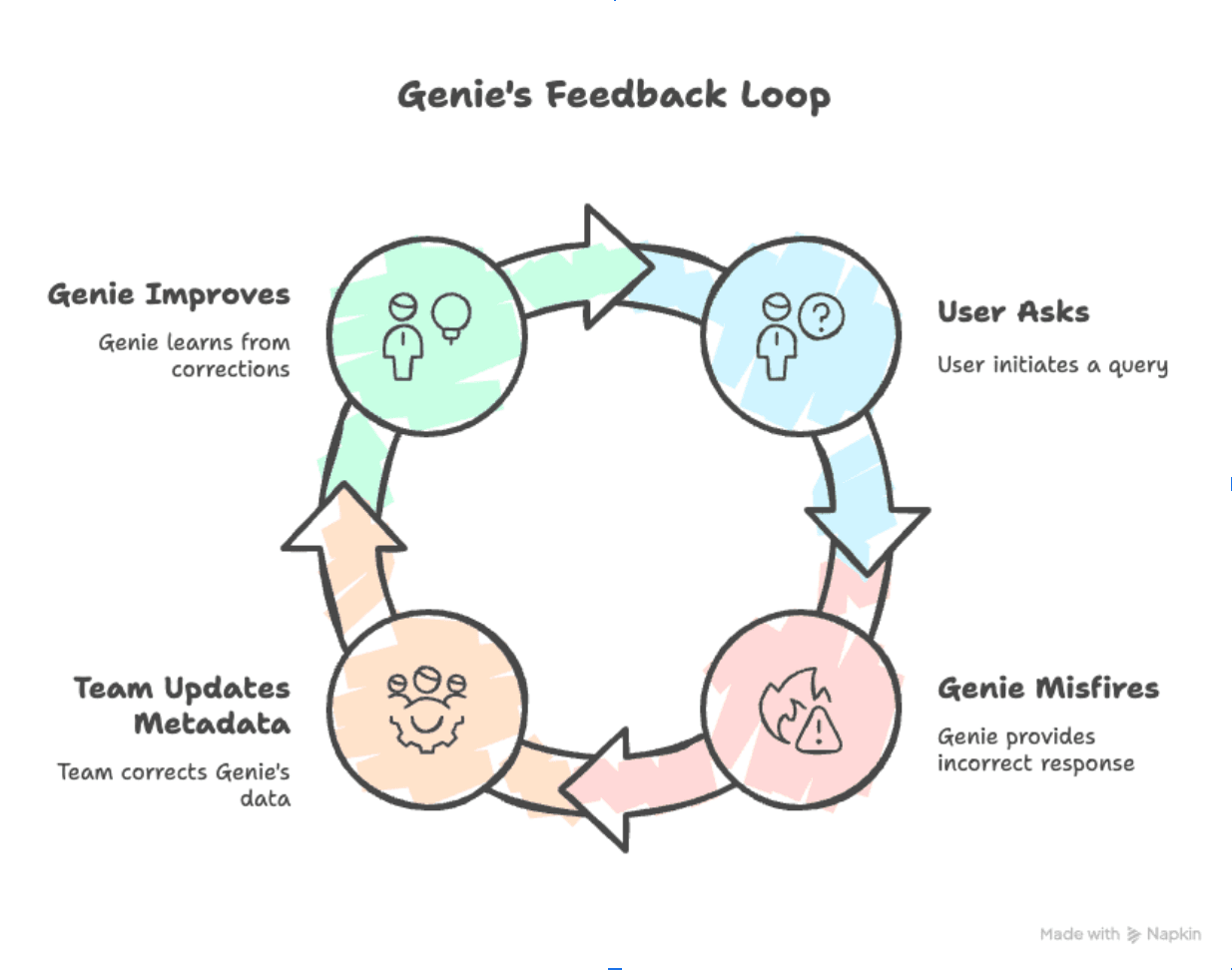
By treating your data like a well-stocked kitchen, giving Genie clear recipes, and implementing these practices, you can ensure a smoother, more accurate user experience and maximize Genie’s full potential. A well-maintained Genie space not only improves insight quality but also fosters greater adoption among users across technical and non-technical roles. Before you know it, Genie will be serving up insights, effortlessly, accurately, and with minimal cleanup.
Consider this practical example: your company wants to quickly pinpoint regions that performed best last quarter. Traditionally, this might involve complicated SQL queries. With Genie, the process simplifies drastically.
You Ask Genie: "Show me our highest-performing sales regions in the first quarter of last year."
Genie’s SQL Response:
SELECT
region,
SUM(sales_amount) AS total_sales
FROM sales_data
WHERE sale_date BETWEEN '2024-01-01' AND '2024-03-31'
GROUP BY region
ORDER BY total_sales DESC
LIMIT 3;
The moment Genie runs this query, Databricks provides you a visual report or an easy-to-understand table displaying your top-performing regions.
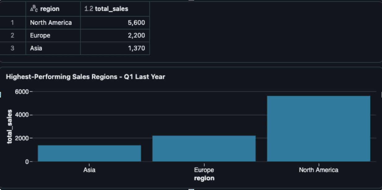
Let’s look at a more sophisticated scenario that works with the available dataset sales_data (with columns: sale_id, region, product, sales_amount, sale_date). This example illustrates how Genie can generate a detailed and complex visualization, such as a stacked area chart or a multi-line comparison chart.
You Ask Genie: "Show a month-wise breakdown of total sales for each product category across all regions over the past year, using a stacked area chart."
Genie’s SQL Response:
SELECT
	month_year,
	product,
	total_sales
FROM (
	SELECT
		DATE_TRUNC('month', sale_date) AS month_year,
		product,
       	SUM(sales_amount) AS total_sales
	FROM sales_data
	WHERE sale_date >= DATE_TRUNC('year', CURRENT_DATE) -
				INTERVAL 1 YEAR
	GROUP BY month_year product
)
ORDER BY month_year, product;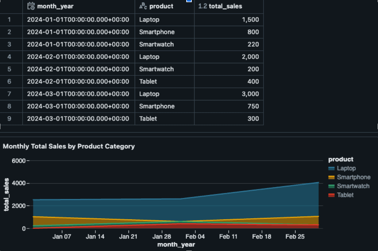
This query aggregates sales by month and product type over the last 12 months. When visualized as a stacked area chart, this output allows business users to identify:
Imagine your organization has expanded data sources beyond sales_data. You now have two additional tables:
- product_hierarchy:
CREATE TABLE product_hierarchy (
product VARCHAR(100),
category VARCHAR(50),
subcategory VARCHAR(50)
);
- region_info:
CREATE TABLE region_info (
region VARCHAR(50),
manager_name VARCHAR(100),
region_group VARCHAR(50)
);
You Ask Genie: "Identify, for each category and region, the month-over-month percentage change in total sales for the last 12 months. Then, filter to include only those category-region pairs where any month shows at least a 20% increase. Finally, join with region_info to include the manager’s name, and rank the top 5 category-region combinations by their average monthly growth."
Genie’s SQL Response:
WITH filtered_sales AS (
    SELECT * FROM sales_data
    WHERE sale_date BETWEEN '2024-01-01' AND '2024-03-31'
),
joined_data AS (
    SELECT
        sd.*, ph.category, ri.manager_name
    FROM filtered_sales sd
    JOIN product_hierarchy ph
        ON sd.product = ph.product
    JOIN region_info ri
        ON region = ri.region
),
monthly_sales AS (
    SELECT
        category,
        region,
        DATE_TRUNC('month', sale_date) AS month,
        SUM(sales_amount) AS total_sales
    FROM joined_data
    GROUP BY category, region, DATE_TRUNC('month', sale_date)
),
percentage_change AS (
    SELECT
        category, region, month, total_sales,
        (
            try_divide(
                total_sales, LAG(total_sales) OVER (
                    PARTITION BY category, region ORDER BY month
                )
            ) - 1
) * 100 AS percentage_change
FROM monthly_sales
),
filtered_data AS (
    SELECT
        category, region, manager_name,
        AVG(percentage_change) AS avg_monthly_growth
    FROM percentage_change JOIN joined_data USING (category, region)
    WHERE percentage_change >= 20
    GROUP BY category, region, manager_name
),
ranked_data AS (
    SELECT
        category, region, manager_name, avg_monthly_growth,
        ROW_NUMBER() OVER (ORDER BY avg_monthly_growth DESC) AS rank
    FROM filtered_data
)
SELECT * FROM ranked_data WHERE rank <= 5
ORDER BY rankImagine a world where anyone on your team, whether they’re in marketing, sales, or even executive leadership, can type a simple question and get real insights without waiting on a data engineer. Genie makes that possible. By removing the need to learn SQL, Genie puts data at everyone’s fingertips. Now, a marketer can ask, “Which campaign drove the most sign-ups last month?” and see the answer in seconds. This kind of access not only speeds up everyday tasks but also helps build a truly data-driven culture, where decisions aren’t based on gut feeling but on clear, up-to-date information.
Writing and debugging SQL queries can easily eat up hours of your team’s day. With Genie handling that heavy lifting, your analysts and engineers can focus on higher-value work, like exploring new hypotheses, fine-tuning models, or developing data-driven strategies. Instead of spending time troubleshooting a malformed JOIN or chasing down a missing column, they can jump straight into interpreting results and making recommendations. In other words, Genie turns the hours you used to spend on syntax headaches into productive, impactful work.
When insights take hours or days to reach decision-makers, opportunities can slip through the cracks. With Genie, answers are available almost instantly. Whether it’s spotting a sudden dip in customer engagement or identifying a top-performing product line, your team can react immediately. Faster insights mean you can pivot marketing tactics, optimize pricing, or adjust operations on the fly, giving you a real edge over competitors who are still wrangling slow, manual processes.
In short, Genie doesn’t just simplify SQL; it empowers your entire organization to move faster, think smarter, and stay ahead in a rapidly changing market.
Implementing Databricks Genie is designed to be straightforward:
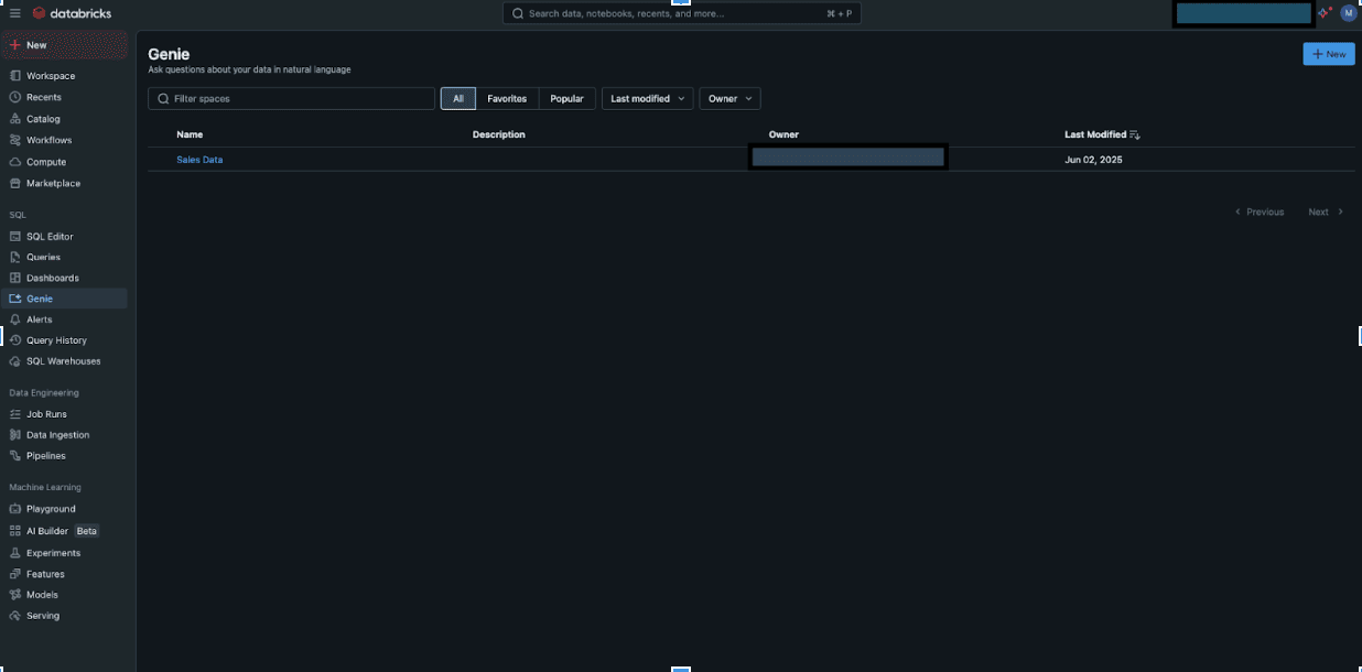
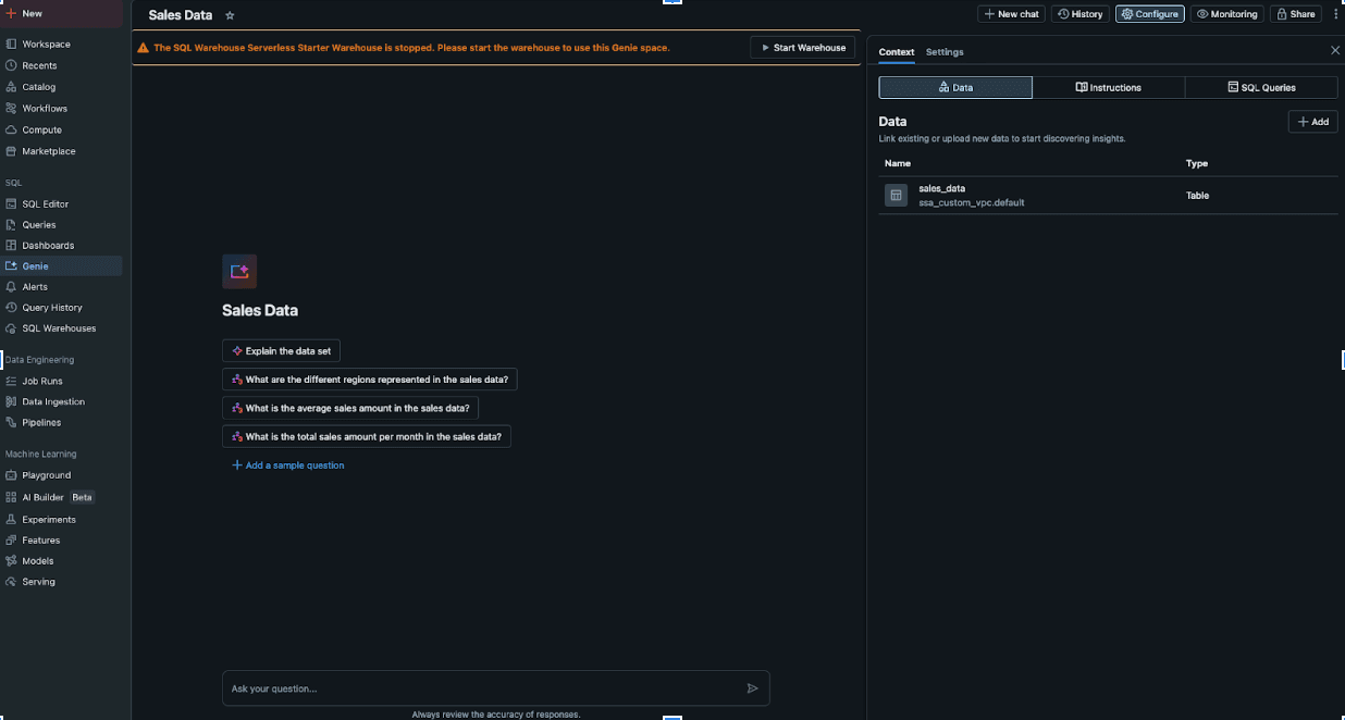
Think of Genie as an assistant that only sees the data you give it permission to access, even down to individual rows. With Unity Catalog’s fine-grained controls, you can, for example, allow each salesperson to query only their own region’s sales figures. So if Alice’s territory is “North America,” you’d grant her a row-level policy such as WHERE region = 'North America'. Meanwhile, Bob in EMEA could have a policy like WHERE region = 'Europe'. At the same time, your finance team might need global visibility, so you’d give them broader access without a row filter.
To set this up:
Alice (North America):
CREATE ROW FILTER north_america_sales ON sales_data FOR SELECT USING (region = 'North America');Bob (EMEA):
CREATE ROW FILTER emea_sales ON sales_data FOR SELECT
USING (region = 'Europe');
By combining standard SELECT privileges with row-level filters, you ensure that users get exactly the right slice of data. This approach not only strengthens security but also means every response Genie returns is automatically scoped to what each person is allowed to see, no extra steps needed.
As of mid-2025, Databricks Genie has evolved into a powerful tool for natural language querying and data visualization. However, certain limitations persist that users should be aware of:
a) Max 25 Tables/Views per Space: If you hit that cap, you’ll need to split your data into another Genie space or rethink which tables really need to be exposed.
b) Throughput Cap (20 Questions/Minute): In a busy environment, you might notice a slowdown if multiple people are firing off queries at once.
c) Conversation Size (10,000 Conversations × 10,000 Messages): This is generous, but very long-running, chatty projects could bump up against it.
a) Unity Catalog Dependency: Genie only understands data registered in Unity Catalog, and users need SELECT rights on tables or views plus CAN USE on the SQL warehouse.
b) Admin-Only Setup Steps: Granting those permissions or adjusting compute settings usually requires administrator access. If you’re not an admin, you’ll need to coordinate with one.
a) No Interactive Chart Edits: If you want to split a bar chart further, apply a new filter, or tweak colors on the fly, you’ll have to edit your SQL or adjust your dataset manually.
a) Metadata Matters: Genie leans heavily on well-documented tables and clear instructions. If your column names are cryptic or your hints are missing, the answers might be fuzzy.
b) Ambiguity Can Confuse It: Complex questions without enough context can trip Genie up. Providing examples or a short cheat sheet goes a long way.
a) Public Preview Only: You can use Genie’s Conversation API today, think Slack or Teams integrations, but the feature set is still growing. Don’t expect every endpoint or capability you might see in the future.
Understanding these limitations is crucial for effectively leveraging Genie in your data strategy. By acknowledging and planning for these constraints, organizations can better integrate Genie into their workflows and maximize its benefits.
To deepen your understanding of Databricks Genie and related technologies, consider these valuable resources:
Ultimately, Databricks Genie is more than just a technology feature; it represents a cultural shift toward accessibility and ease of use in data analytics. It empowers your entire organization, from novices to experts, to seamlessly access and interpret complex data. By reducing the complexity involved in data analysis, Genie ensures your team can focus on what matters most: driving your business forward.
...Loading Related Blogs
Trusted by top platforms for our transformative solutions and exceptional results: