

 Add as preferred on Google
The Future of Education Technology in 2027: How AI Is Changing Learning for All AgesRead More
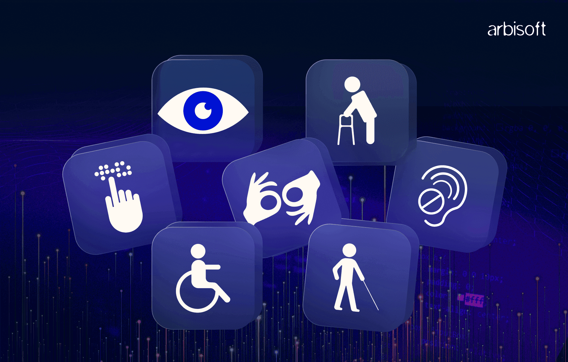
Have you ever found it hard to use your phone in bright sunlight or tried tapping a button while holding groceries in one hand? These moments show how important good mobile design is. Now imagine if these challenges weren’t just once in a while, but happened every day because of a visual, hearing, movement, or learning disability.
That’s where mobile accessibility becomes essential.
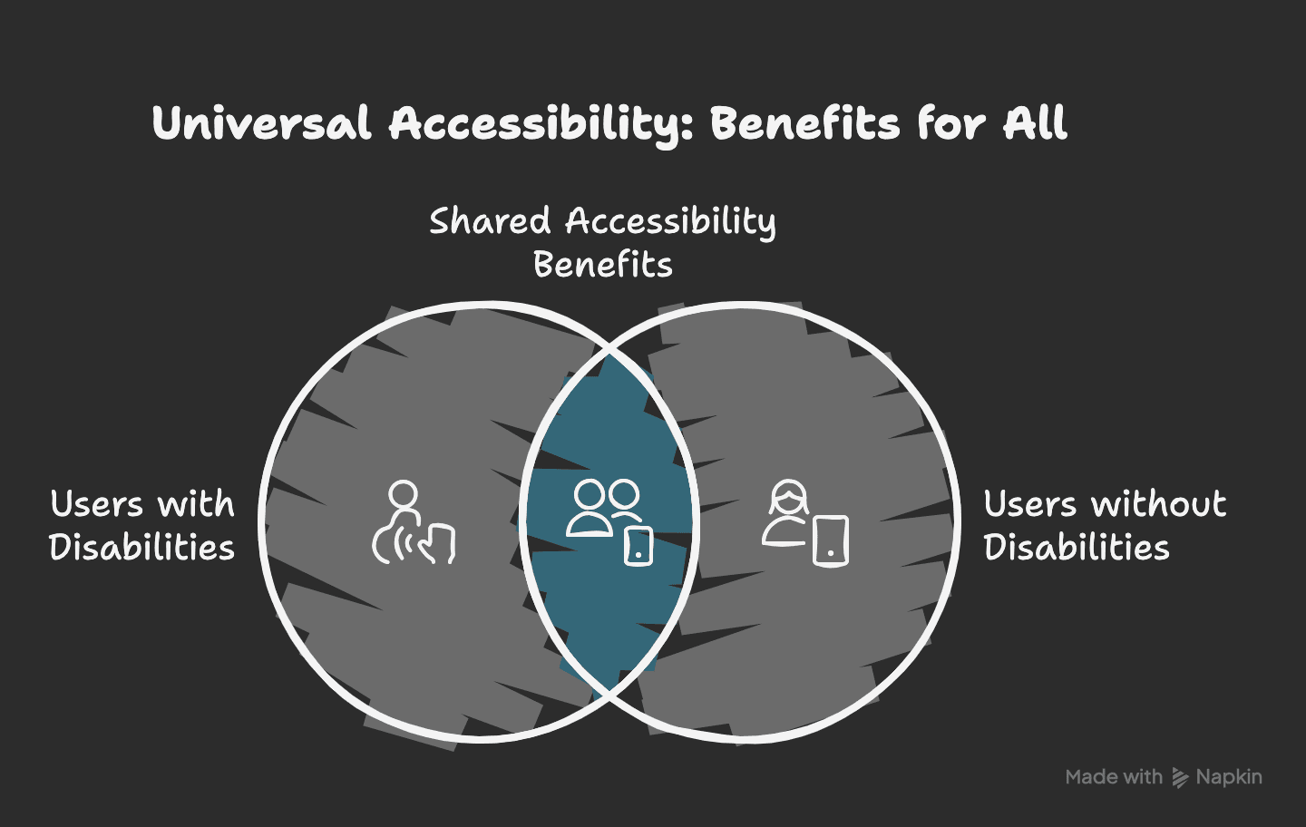
Mobile accessibility means designing apps that everyone can use, including people with:
Accessibility features don’t only help people with permanent disabilities. Tools like screen readers, voice controls, and adjustable text sizes also help in everyday situations, like when you’re multitasking, tired, or in a noisy place.
Here’s why mobile developers and designers should make accessibility a priority:
Everyone should be able to use digital tools. Accessible apps make sure no one is left out.
Accessibility isn’t just good practice—it’s often required by law. Countries like the US (ADA), the UK (Equality Act), and the EU have accessibility laws. Ignoring them can lead to legal action or fines.
Accessible apps are usually easier to use. Clean layouts and clear navigation help everyone, not just people with disabilities.
When your app is inclusive, more people can use it. This could include millions of users who might otherwise be left out.

Many apps create problems for users without meaning to. Common issues include:
- Text that’s too small or hard to read
- Low contrast between text and background
- Buttons that are too small, close together, or not labeled
- Images without descriptions or alt text
- Videos or audio without captions or transcripts
These issues can make your app unusable for some people.

You don’t need to be an expert to begin. Here are some simple steps to make your app more inclusive:
Add clear labels to buttons, icons, and images. This helps screen readers describe them to users.
Avoid vague phrases like “Click here.” Use specific labels like “Submit Form” or “Add to Wishlist.” If there’s a heart icon, label it “Add to Favorites” so the purpose is clear.
Text should be easy to read against the background, especially for users with low vision or color blindness.
Follow WCAG 2.1 guidelines:
For example, light gray (#999999) on white (#FFFFFF) has a contrast ratio of only 2.6:1, which doesn’t meet the standard. A darker gray, like #333333 works much better.
Use VoiceOver on iOS or TalkBack on Android to check how a visually impaired user navigates your app.
While testing:
This kind of testing shows you problems that code reviews might miss.
If your app has videos or audio, make sure users with hearing impairments can still access the content.
For example, popular podcasts like The Daily offer full transcripts to reach more listeners.
Touch targets should be large enough and not too close together to avoid accidental taps.
This helps users with motor challenges and makes navigation easier for everyone.
Let users adjust text size, switch themes, or rotate the screen.
These settings let users shape the app to fit their needs and make the experience smoother.

Making your app accessible isn’t just about following rules; it’s about creating something that works for everyone. Every design choice that removes a barrier makes your app easier to use, more inclusive, and more successful.
Whether you’re a developer, designer, or content writer, you can help improve accessibility.
Take Your First Step Today
Start small. Check your app’s text size, contrast, and button spacing. A few small changes can make a big impact.
Need expert help with accessibility testing?
Contact Us. We’d love to help you build apps that everyone can enjoy.
...Loading Related Blogs
Trusted by top platforms for our transformative solutions and exceptional results: