Trusted by Market Leaders in Education, Travel, Finance and E-commerce since 2007


We put excellence, value and quality above all - and it shows


A Technology Partnership That Goes Beyond Code

“Arbisoft has been my most trusted technology partner for now over 15 years. Arbisoft has very unique methods of recruiting and training, and the results demonstrate that. They have great teams, great positive attitudes and great communication.”


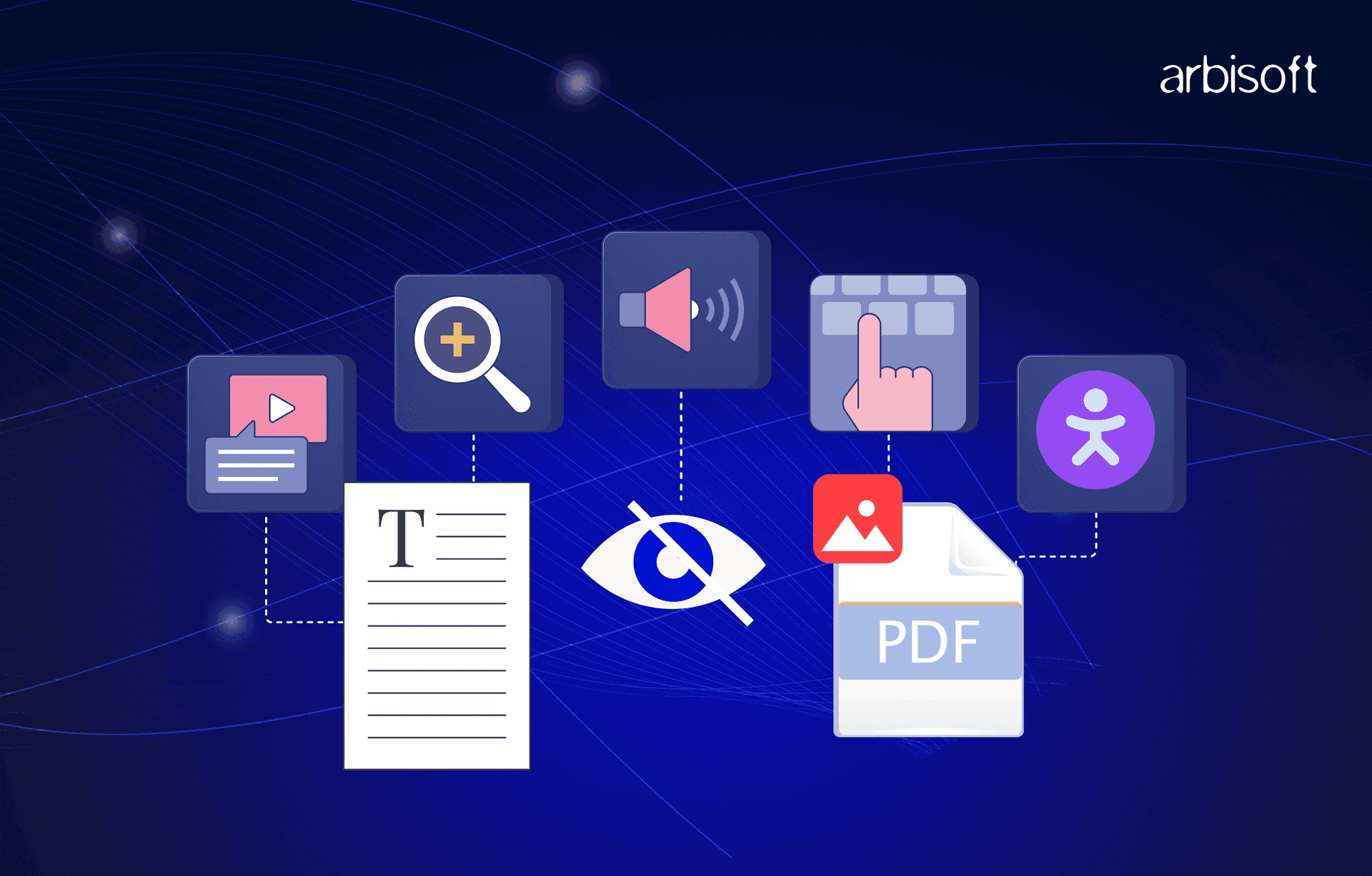
Document Accessibility Made Easy: A Practical Guide for Everyone

The Story We Often Miss
“She had to wait days for someone to read it aloud—all because the PDF wasn’t accessible.”
Last year, a visually impaired employee received an important company policy update as a scanned PDF with no tags, no text recognition, and no descriptions.
As a result, it took several days before anyone could read it out loud to her.
It’s easy to think this is an edge case, but imagine this happening to:
- An employee with dyslexia having trouble reading text that is both tiny and low in contrast.
- A new parent trying to read a company handbook on a phone while holding a baby.
- A client whose first language isn’t English, relying on translation software that can’t parse your poorly structured file.
- A contractor in an isolated region with poor connectivity, unable to download your heavy, uncompressed PDF.
Every time we send a document that someone can’t access, we unintentionally shut them out. The good news? Document accessibility isn’t complicated once you know the right steps.
Why Document Accessibility Matters
Document accessibility means creating files (PDFs, Word documents, PowerPoint decks, etc.) that everyone can read, understand, and navigate, including people with visual, auditory, motor, or cognitive disabilities.
When you make documents accessible:
- You expand your audience. People of all abilities, devices, and languages can engage with your content.
- You reduce legal risk. Many countries have accessibility laws (like ADA, Section 508, or EN 301 549 in the EU), and lawsuits for inaccessible content are increasing.
- You improve usability for everyone. Well-structured headings, easy-to-read fonts, and meaningful link text benefit every reader, not only people with disabilities.
Think of accessibility as good communication, the same way subtitles help people in noisy cafes, or ramps help parents with strollers, accessible documents help everyone. And the best part? These changes are often small, quick, and cost almost nothing to implement.
7 Common Document Accessibility Mistakes (and How to Fix Them)
1. Missing Headings and Structure
The problem: Walls of text with no headings make it hard for screen readers to navigate and exhausting for all readers.
The fix: Use built-in heading styles (H1, H2, H3) instead of just bold text. This ensures screen readers can identify and jump between sections easily.
Pro Tip - In Microsoft Word:
- Windows: Use Alt + Shift + 1 → To apply Heading level 1, and so on.
- Mac: Use Command + Option + 1 → To apply Heading level 1, and so on.
Avoid skipping heading levels; don’t jump from H1 straight to H3.
2. No Alt Text for Images
The problem: Screen readers can’t “see” images, so without alt text, you’re leaving gaps.
The fix: Add concise alt text that explains the image’s purpose, not just its content.
Example: Replace “Image of a chart” with “Bar chart illustrating a 20% sales growth in Q2 over Q1.”
Shortcut: In Word, right-click the image and choose Edit Alt Text from the menu.
Pro Tip: Don’t use “Image of…” screen readers already tell users it’s an image.
3. Poor Color Contrast
The problem: That trendy light-gray-on-white look? For many, it’s almost impossible to read.
The fix: Tools like WebAIM Contrast Checker are used to verify a minimum 4.5:1 contrast ratio for normal text with its background.
Example: Dark navy text on white is accessible; pale yellow on white is not.
Extra Tip: Don’t rely on your eyes alone—even if it looks okay to you, it might fail for others.
4. Over-Reliance on Color
The problem: “Red means stop, green means go” doesn’t work for color-blind users.
The fix: Pair color with labels, patterns, or icons.
Instead of only coloring overdue tasks red, mark them with a 🔴 icon and the word “Overdue.”
This approach helps everyone, including those printing in black and white.
5. Inaccessible Tables
The problem: Screen readers can’t make sense of complex or unlabeled tables.
The fix:
- Add clear column headers.
- Avoid merged cells.
- Keep the layout simple.
Shortcut: In Word, highlight the table, go to Table Design, and tick the Header Row box.
Extra Tip: If your table is too complex, break it into smaller tables or use a list format.
6. Scanned PDFs with No OCR
The problem: A scanned image of text is invisible to assistive tech.
The fix: Use Optical Character Recognition (OCR) tools to make text selectable.
In Adobe Acrobat Pro, go to Tools → Scan & OCR → Recognize Text.
Pro Tip: Save your document directly as an accessible PDF instead of printing and scanning whenever possible; it preserves the original text layer.
7. Links Without Context
The problem: “Click here” means nothing out of context.
The fix: Use descriptive link text.
Bad: Click here
Better: Download the 2024 Accessibility Guide (PDF)
Bonus Tip: Make sure link text still makes sense when read on its own; screen readers often list all links separately.
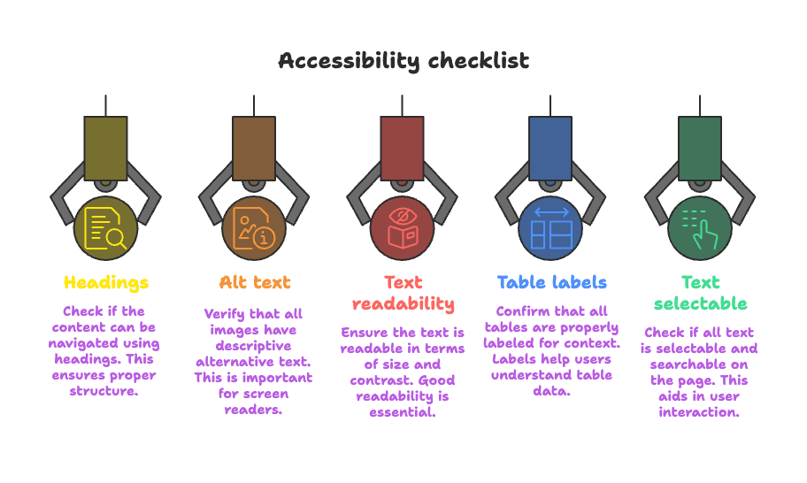
Quick Accessibility Checklist for Any Document
- Can it be navigated using headings?
- Do images have alt text?
- Does the text have a size and contrast that make it easy to read?
- Are tables properly labeled?
- Is all text selectable and searchable?
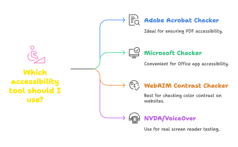
Accessibility Tools to Try
- Adobe Acrobat Accessibility Checker: Best for PDFs.
- Microsoft Accessibility Checker: Built into Office apps.
- WebAIM Contrast Checker: A simple web tool for colors.
- NVDA (Windows) or VoiceOver (Mac): Test your document with a real screen reader.
Engaging Your Audience With Accessibility
Accessibility goes beyond meeting legal requirements; it can give you a business edge.
Companies that invest in accessible content see:
Improved engagement, audiences can comfortably access and understand the material.
Better SEO—headings, alt text, and structured data help search engines too.
Improved brand reputation, you’re seen as inclusive and forward-thinking.
And remember, accessibility benefits more people than you might think. Even temporary conditions like a broken arm, a lost pair of glasses, or poor Wi-Fi can make accessible content a necessity.
The Bigger Picture
“Accessibility isn’t a box to tick—it’s a sign that everyone is welcome.”
An accessible PDF benefits everyone, not only people with disabilities. It’s for the parent holding a toddler, the commuter reading on a phone, or the employee working with translation software.
When you create your documents for accessibility, you’re showing your audience that:
“We see you. We value you. We want you to participate.”
Your Next Step
Take one document you created last week. Run it through an accessibility checker. Fix what you find. Small changes today will open doors for more people tomorrow. And in the process, you’ll make your content cleaner, clearer, and more effective for everyone.
Just published