Trusted by Market Leaders in Education, Travel, Finance and E-commerce since 2007


We put excellence, value and quality above all - and it shows


A Technology Partnership That Goes Beyond Code

“Arbisoft has been my most trusted technology partner for now over 15 years. Arbisoft has very unique methods of recruiting and training, and the results demonstrate that. They have great teams, great positive attitudes and great communication.”


Developing for Colorblind Users: Practical Accessibility Tips


Colors are one of the most powerful tools in a developer’s UI toolkit used for indicating success, warnings, required fields, status changes, and more. But what happens when the user can’t perceive those colors correctly?
Around 300 million+ people globally live with some form of color vision deficiency, commonly known as colorblindness. If you're developing interfaces that use color without alternatives, you're likely creating barriers for these users.
This blog will walk you through real-world examples, code snippets, and developer-friendly practices to make your front ends colorblind-accessible, aligning with standards like WCAG 2.2, ADA, and the European Accessibility Act.
Understanding Colorblindness Through a Developer’s Lens
Colorblindness doesn’t mean users can’t see color at all. Most colorblind individuals can perceive a range of colors, but some shades may appear alike to them.
Common Types of Color Vision Deficiency
Type | Description |
Deuteranopia | Red-green confusion (green-weak) |
Protanopia | Red-green confusion (red-weak) |
Tritanopia | Blue-yellow confusion |
Monochromacy | No color perception |
As a developer, if you’re highlighting a required field in red, that user might never realize it’s required.
Real-World Accessibility Failures (and Fixes)
1. Highlighting Input Errors Using Red Only
You build a form and mark errors by simply changing the border to red.
<!-- BAD: Color is the only indicator -->
<input type="text" style="border: 2px solid red;">
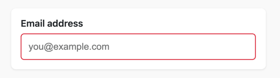
A person with colorblindness may not perceive this red as distinct.
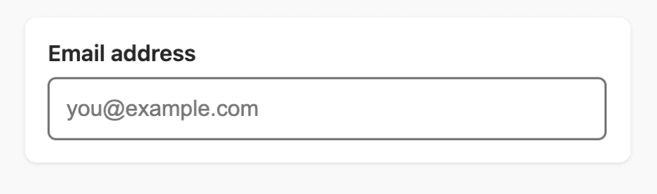
Fix: Add an icon, message, and ARIA label
<div>
 <label for="email">Email</label>
 <input id="email" type="text" aria-describedby="error-email" style="border: 2px solid red;">
 <span id="error-email" style="color: red;">
   ❌ Please enter a valid email address.
 </span>
</div>
Now you’ve added:
- A visible icon/message
- Redundant information
- Screen reader context
Now, even a colorblind person can easily perceive the error.
2. Status Indicators Only Using Color (Green/Red Dots)
Consider this example in a dashboard:
<span class="status-indicator" style="color: green;">🟢</span>
<span class="status-indicator" style="color: red;">🔴</span>
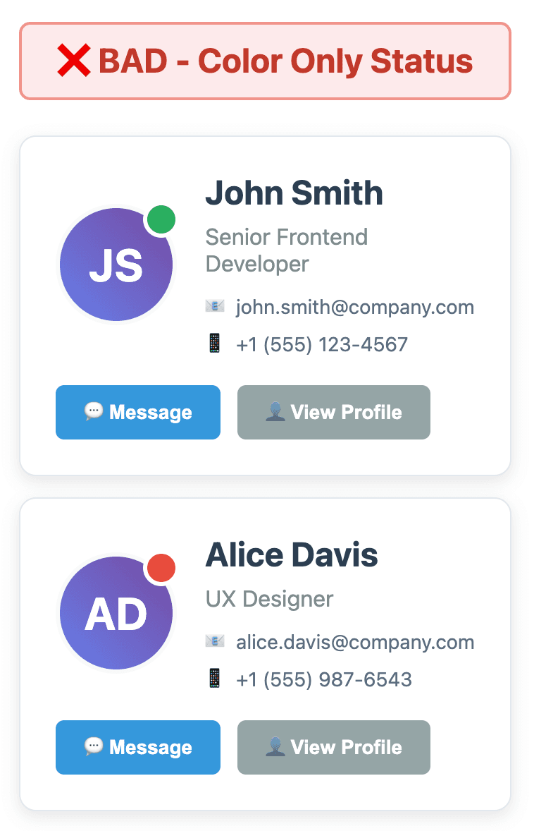
Colorblind users may see both dots as similar.
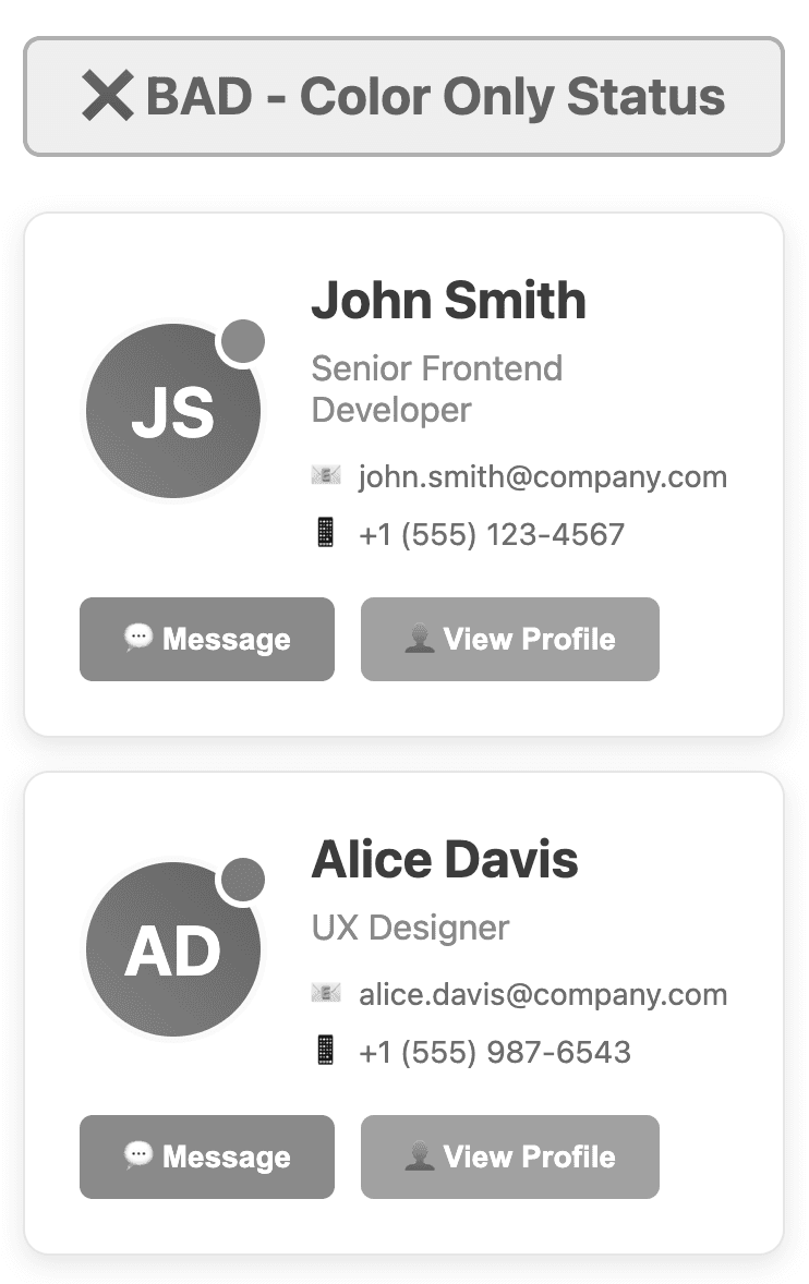
Fix: Add text, icons, or ARIA labels
<span aria-label="Status: Active" role="status">🟢 Online</span>
<span aria-label="Status: Offline" role="status">🔴 Offline</span>
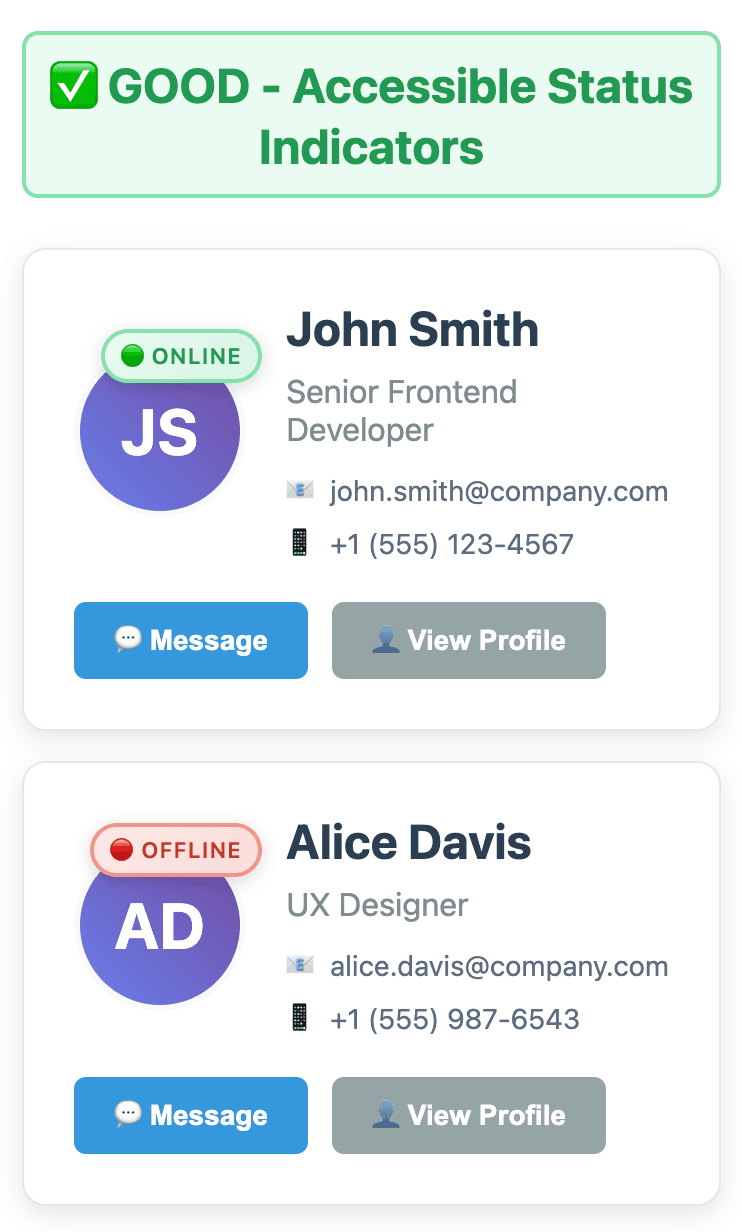
Colorblind users will see the following view:
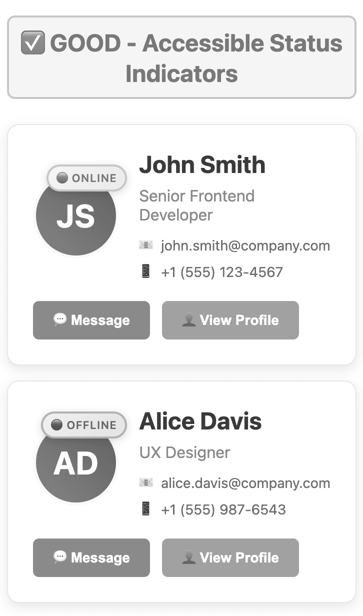
Or use different shapes entirely:
🟢 Active | ⛔ Offline
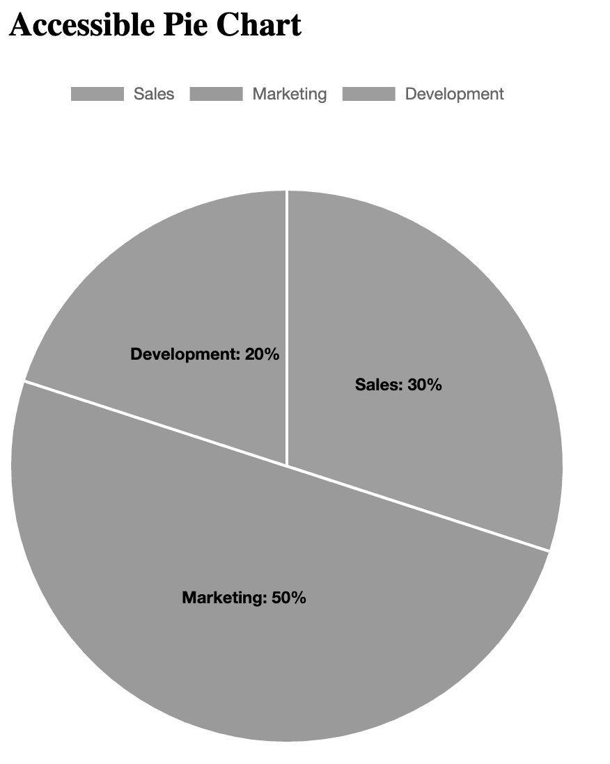
3. Data Visualizations Using Colors Only
Charts and graphs are common in apps, but they’re often unusable for colorblind users.
// Chart Example - Bad
datasets: [{
 label: '[Development, Sales, Marketing]',
 data: [20%, 30%, 50%],
 backgroundColor: [blue, 'red', 'green']
}]
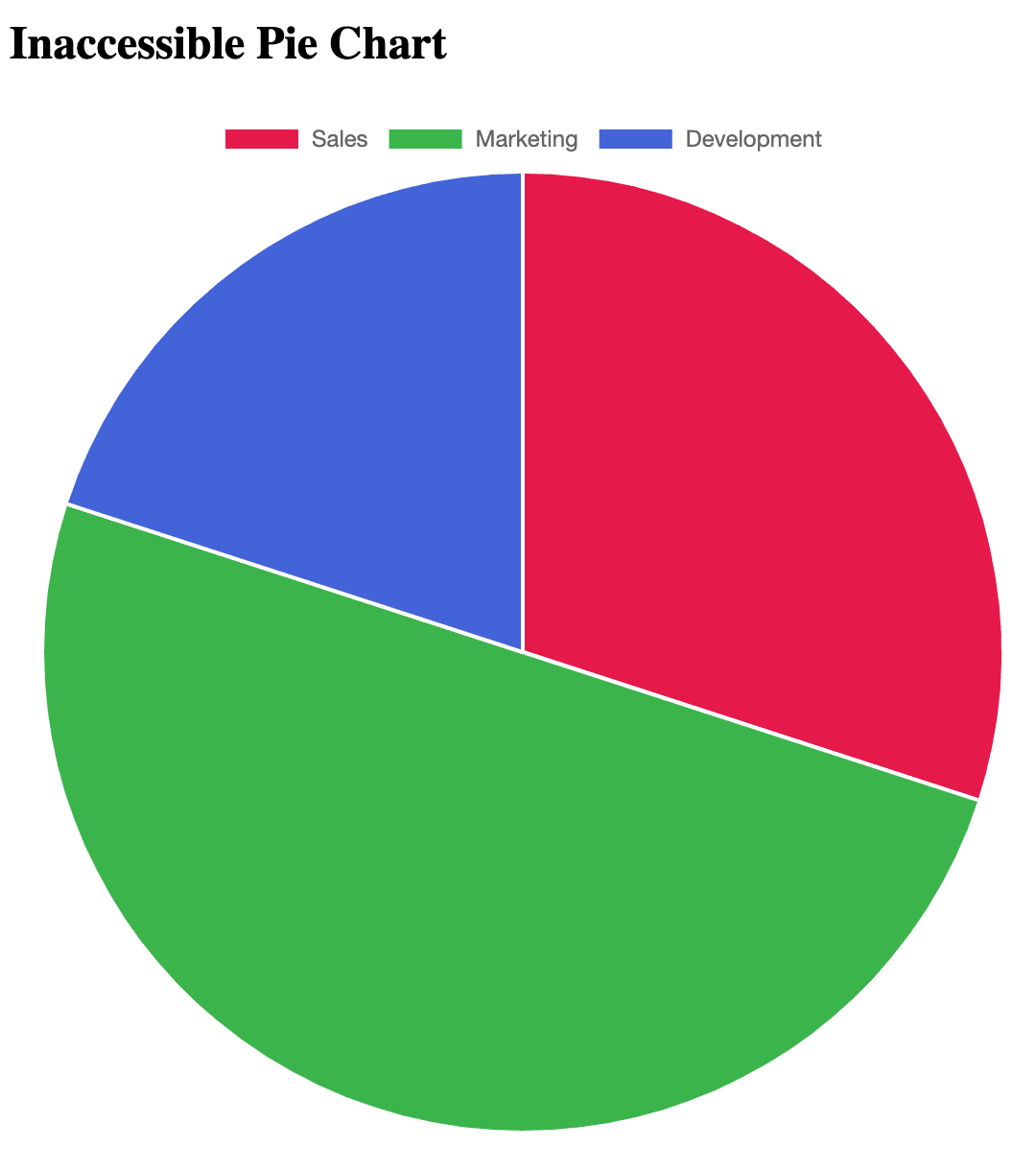
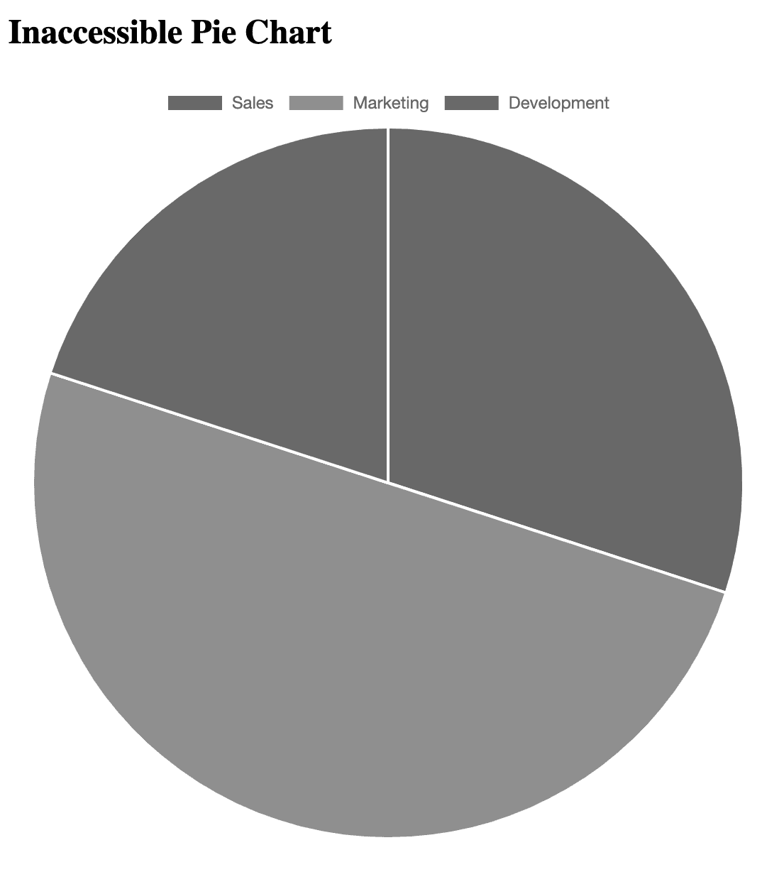
Red and green will blur for many. A colorblind person will see the following view:
Fix: Use colorblind-friendly colors and patterns
datasets: [{
 label: ‘Development, Sales, Marketing',
 data: [20%, 30%, 50%],
 backgroundColor: ['#0072B2', '#D55E00', '#009E73'],
}]
Also:
- Add data labels
- Use hover tooltips
- Consider different patterns/fills in SVGs
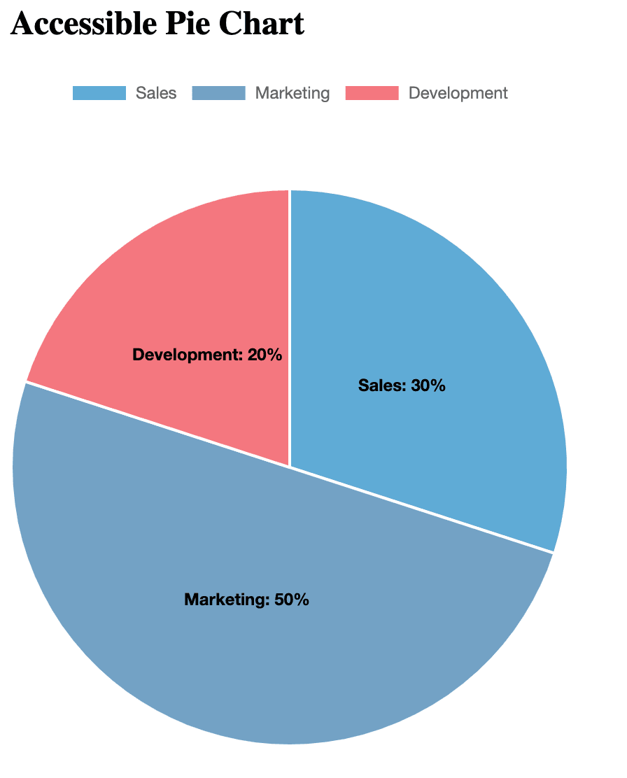
Colorblind people will see the following view:
Tools for Developers to Test Color Accessibility
Tool | Purpose |
WebAIM Contrast Checker | Checks color contrast ratios |
Colorblindly Chrome Extension | Simulates various types of colorblindness |
Figma “Color Blind” Plugin | Simulates CVD while designing |
Accessible Color Matrix | Builds colorblind-safe palettes |
Run your UI through at least one of these before release.
Standards and Compliance
By making your apps color-accessible, you're aligning with:
Standard | Requirement |
WCAG 2.2 – SC 1.4.1 | Color cannot be the sole indicator |
WCAG 2.2 – SC 1.4.3 | Text must have sufficient contrast |
ADA & Section 508 | Legal mandates for accessible UIs |
European Accessibility Act | Applies to public-facing products in the EU |
Accessibility isn't just a moral obligation; it's mandatory in many jurisdictions.
Developer Checklist
- Never use color as the only cue.
- Use text, icons, or shapes along with color.
- Ensure contrast ratios ≥ 4.5:1.
- Label charts clearly with text or tooltips.
- Add ARIA attributes for screen readers.
- Test with simulators and extensions.
- Follow WCAG guidelines and log issues early.
Conclusion
Developing for colorblind users doesn’t require reinventing your UI. It takes attention to detail, intentional coding practices, and a commitment to inclusion.
Start small:
- Fix one component.
- Test one form.
- Adjust one chart.
Every time you make your UI more inclusive, you make your product better for everyone. If you require any assistance with accessibility, you’re welcome to contact Arbisoft’s Accessibility Team.
Just published