Trusted by Market Leaders in Education, Travel, Finance and E-commerce since 2007


We put excellence, value and quality above all - and it shows


A Technology Partnership That Goes Beyond Code

“Arbisoft has been my most trusted technology partner for now over 15 years. Arbisoft has very unique methods of recruiting and training, and the results demonstrate that. They have great teams, great positive attitudes and great communication.”


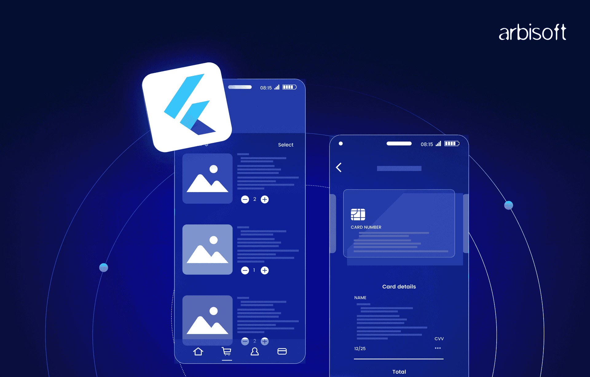
Building Killer Custom UI Components in Flutter: Why Everyone's Ditching Pre-Made Libraries

Three years ago, I was that Flutter developer who grabbed every UI package from pub.dev instead of building my own components. Need a fancy button? There's a package. Want a custom slider? Another package. My pubspec.yaml looked like a phone book, and my app bundle size was approaching "small desktop application" territory.
Then I worked on a project where the design team handed me mockups that looked nothing like Material Design or any existing package. That's when I realized something crucial: if you want your Flutter app to stand out, you need to build your own UI components. Not just tweak existing ones - actually build them from scratch.
The crazy part? It's way easier than most developers think, and the results are dramatically better. Custom components that perfectly match your design, with exactly the behavior you want, and zero dependency bloat. Let me show you how to stop being a package collector and start being a component creator.
Why Custom Components Beat Off-the-Shelf Every Time
Here's the thing about using pre-built UI packages: you're essentially letting someone else make design decisions for your app. That fancy carousel package might work great for their use case, but what happens when your design calls for something slightly different?
I spent two weeks trying to customize a date picker package to match our app's design language. Two weeks! I could have built the entire component from scratch in three days and had complete control over every pixel. That's when I stopped looking for packages and started building my own toolkit.
Custom components give you superpowers. Need to animate between states in a specific way? You control the animation curves. Want gesture handling that feels just right? You define the interaction model. Performance optimization for your specific use case? You decide what gets rebuilt and when.
Plus, your app stops looking like every other Flutter app out there. Users can't point to a specific component and say "oh, that's the same widget from that other app." Your interface becomes truly yours.
The Real-World Impact of Going Custom
Performance That Actually Matters
Last year, I consulted for a fitness app that was struggling with list performance. They were using a third-party workout card component that looked nice but was rebuilding way more than necessary. Each scroll event triggered rebuilds of off-screen widgets, causing janky animations and battery drain.
We replaced their package-based approach with custom components built specifically for their data structure. Same visual design, but the custom implementation only rebuilt what actually changed. Scroll performance went from "barely acceptable" to "buttery smooth," and battery usage dropped by 30%.
The secret? When you build custom components, you control exactly what triggers rebuilds. You understand your data flow, so you can optimize for your specific patterns rather than the generic patterns that packages assume.
Design Consistency That Designers Actually Love
Working with designers taught me something important: they notice every pixel that's off. That standard Flutter button with slightly wrong corner radius? They see it. The dropdown that doesn't quite match the color palette? They see it too.
Custom components let you nail the design specifications exactly. No more "close enough" compromises or "we'll fix it later" technical debt. When your components are built to your design system from the ground up, everything just looks right.
I built a design system for a e-commerce app where every interactive element had custom micro-animations that reflected the brand personality. Buttons didn't just change color on tap - they had subtle scale animations with custom easing curves. Lists didn't just scroll - they had momentum that felt consistent with the brand's "smooth and premium" positioning.
Maintenance Sanity
Here's something nobody talks about: package dependencies are maintenance nightmares waiting to happen. That date picker package you love? The maintainer might abandon it. That fancy chart library? It might not support the next Flutter version.
With custom components, you control the maintenance schedule. You understand the code because you wrote it. Need to fix a bug? You know exactly where to look. Want to add a feature? You don't need to wait for a package update or fork someone else's code.
Types of Custom Components Worth Building
Data Display Components That Tell Stories
Standard Flutter widgets are designed for generic use cases, but your app has specific data that needs specific presentation. I built a custom chart component for a fitness tracking app that wasn't just about displaying data - it told the story of the user's progress.
Instead of using a chart package that treated all data points equally, our custom component highlighted personal records, showed trend lines that mattered to fitness goals, and had interactions that helped users understand their performance patterns. The data told a story because the component was designed for that specific story.
Financial apps are another great example. A custom stock price component doesn't just show price changes - it can show contextual information, highlight significant movements, and provide interactions that help users make informed decisions. Generic chart packages can't capture that domain-specific intelligence.
Input Components That Feel Natural
Form inputs are where custom components really shine. The standard TextField is fine for basic use cases, but real applications need inputs that understand their context and behave intelligently.
I built a custom address input component that didn't just collect text - it integrated with geolocation, provided smart autocomplete based on user patterns, and adapted its validation rules based on the detected country. Users stopped making input errors because the component was designed to prevent them.
Credit card inputs are another perfect example. A custom component can format numbers as you type, detect card types from the first few digits, show appropriate validation states, and handle edge cases that generic input packages miss.
Navigation Components That Guide Users
Navigation isn't just about moving between screens - it's about helping users understand where they are and where they can go. Custom navigation components can encode your app's information architecture in ways that standard navigation widgets simply can't.
For a learning app, I built a custom progress navigation that showed not just current position, but learning path dependencies, completion states, and suggested next steps. Users could see their journey through the content and understand how pieces connected together.
The component wasn't just functional - it motivated users by visualizing their progress and making complex learning paths feel manageable. No off-the-shelf navigation component could have captured that domain-specific guidance logic.
Learning to Build Custom Components (The Real Timeline)
Week 1: "StatelessWidget vs StatefulWidget - I Get It Now"
Your first week will be spent understanding Flutter's component model. StatelessWidget for components that just display data, StatefulWidget for components that need to track changing state. This sounds simple, but it takes practice to really internalize when to use which approach.
Start with simple display components. Build a custom card that displays data exactly how your design specifies. No fancy interactions yet - just nail the visual presentation and understand how to pass data into your component.
You'll probably build the same component three different ways as you figure out the best approach. That's normal and valuable learning.
Week 2-3: "State Management Actually Makes Sense"
This is where you'll start building components that respond to user interaction. A custom button that has pressed states, hover effects (for web), and disabled states. You'll learn how setState works and why it's both powerful and dangerous.
The breakthrough moment comes when you realize that state management in custom components follows the same patterns as state management in full applications. The same principles apply, just at a smaller scale.
You'll also start understanding the widget lifecycle and why it matters for performance. When does your component rebuild? What triggers state changes? How do you prevent unnecessary rebuilds?
Week 4-6: "I Can Build Anything Now"
By now you're building components with complex interactions. Multi-touch gestures, drag and drop, custom animations. You understand how to compose smaller components into larger ones and how to manage state across component hierarchies.
This is when you'll probably rewrite some of your earlier components because you now understand better patterns. That's a good sign - it means you're developing judgment about component architecture.
You'll start thinking about reusability and building components that can be configured for different use cases while maintaining consistency.
Month 3-4: "Professional-Grade Component Libraries"
Now you're building components that handle edge cases, accessibility requirements, and platform differences. Your components work well on different screen sizes, respond appropriately to system settings, and provide proper semantics for screen readers.
You understand how to build components that feel native on each platform while maintaining your design language. iOS-style interactions on iOS, Material Design patterns on Android, but with your custom visual treatment.
Most developers I work with are building production-quality custom components within 3-4 months of focused practice.
Setting Up Your Custom Component Development Environment
Do You Need Special Tools?
Nope. If you can build Flutter apps, you can build custom components. Your existing development setup - VS Code, Android Studio, whatever you prefer - works perfectly for component development.
The one tool I strongly recommend is Flutter Inspector. When you're building custom layouts and debugging why widgets aren't behaving as expected, the Inspector becomes invaluable. It shows you the widget tree, layout constraints, and rendering information in real-time.
Essential VS Code Extensions for Component Development
- Flutter Extension - Obviously. But make sure you're using the official one from the Dart Team. It includes the widget inspector integration and hot reload functionality that makes component development fast and interactive.
- Dart Extension - Provides language support, code completion, and static analysis. Essential for catching component API design issues early.
- Flutter Widget Snippets - Saves typing when creating new component classes. Instead of typing out the full StatefulWidget boilerplate, just use snippets.
- Bracket Pair Colorizer - Flutter involves a lot of nested widgets. This extension makes it much easier to track which closing bracket belongs to which opening bracket.
- Flutter Files - Right-click to create new Flutter widget files with proper naming conventions and boilerplate code.
Project Organization That Scales
Here's how I organize custom components in Flutter projects:
lib/
├── components/
│   ├── buttons/
│   │   ├── primary_button.dart
│   │   ├── secondary_button.dart
│   │   └── icon_button.dart
│   ├── inputs/
│   │   ├── text_field.dart
│   │   ├── dropdown.dart
│   │   └── date_picker.dart
│   ├── cards/
│   │   ├── product_card.dart
│   │   └── user_card.dart
│   └── navigation/
│       ├── bottom_nav.dart
│       └── drawer.dart
├── screens/
└── main.dart
Each component gets its own file, grouped by function. This makes components easy to find, import, and maintain as your component library grows.
Actually Building Your First Custom Component
Start Simple: A Custom Button
Let's build something useful but not overwhelming. Here's a custom button that follows your design system instead of Material Design:
class CustomButton extends StatefulWidget {
  final String text;
  final VoidCallback? onPressed;
  final bool isLoading;
  final ButtonStyle style;

  const CustomButton({
    Key? key,
    required this.text,
    this.onPressed,
    this.isLoading = false,
    this.style = ButtonStyle.primary,
  }) : super(key: key);

  @override
  State<CustomButton> createState() => _CustomButtonState();
}

class _CustomButtonState extends State<CustomButton>
    with SingleTickerProviderStateMixin {
  late AnimationController _animationController;
  late Animation<double> _scaleAnimation;
  bool _isPressed = false;

  @overridevoid initState() {
    super.initState();
    _animationController = AnimationController(
      duration: const Duration(milliseconds: 150),
      vsync: this,
    );
    _scaleAnimation = Tween<double>(
      begin: 1.0,
      end: 0.95,
    ).animate(CurvedAnimation(
      parent: _animationController,
      curve: Curves.easeInOut,
    ));
  }

  @override
  Widget build(BuildContext context) {
    return GestureDetector(
      onTapDown: _onTapDown,
      onTapUp: _onTapUp,
      onTapCancel: _onTapCancel,
      onTap: widget.onPressed,
      child: AnimatedBuilder(
        animation: _scaleAnimation,
        builder: (context, child) {
          return Transform.scale(
            scale: _scaleAnimation.value,
            child: Container(
              padding: const EdgeInsets.symmetric(
                horizontal: 24,
                vertical: 12,
              ),
              decoration: BoxDecoration(
                color: _getBackgroundColor(),
                borderRadius: BorderRadius.circular(8),
                boxShadow: _isPressed ? [] : [
                  BoxShadow(
                    color: Colors.black.withOpacity(0.1),
                    blurRadius: 4,
                    offset: const Offset(0, 2),
                  ),
                ],
              ),
              child: widget.isLoading
                  ? const SizedBox(
                      height: 20,
                      width: 20,
                      child: CircularProgressIndicator(
                        strokeWidth: 2,
                        valueColor: AlwaysStoppedAnimation(Colors.white),
                      ),
                    )
                  : Text(
                      widget.text,
                      style: TextStyle(
                        color: _getTextColor(),
                        fontWeight: FontWeight.w600,
                        fontSize: 16,
                      ),
                    ),
            ),
          );
        },
      ),
    );
  }

  void _onTapDown(TapDownDetails details) {
    if (widget.onPressed != null) {
      setState(() => _isPressed = true);
      _animationController.forward();
    }
  }

  void _onTapUp(TapUpDetails details) {
    setState(() => _isPressed = false);
    _animationController.reverse();
  }

  void _onTapCancel() {
    setState(() => _isPressed = false);
    _animationController.reverse();
  }

  Color _getBackgroundColor() {
    if (widget.onPressed == null) {
      return Colors.grey.shade300;
    }
    switch (widget.style) {
      case ButtonStyle.primary:
        return Colors.blue;
      case ButtonStyle.secondary:
        return Colors.grey.shade200;
      case ButtonStyle.danger:
        return Colors.red;
    }
  }

  Color _getTextColor() {
    if (widget.onPressed == null) {
      return Colors.grey.shade600;
    }
    switch (widget.style) {
      case ButtonStyle.primary:
        return Colors.white;
      case ButtonStyle.secondary:
        return Colors.black87;
      case ButtonStyle.danger:
        return Colors.white;
    }
  }

  @overridevoid dispose() {
    _animationController.dispose();
    super.dispose();
  }
}

enum ButtonStyle { primary, secondary, danger }
This button demonstrates several important concepts:
- State management for tracking pressed state and loading state
- Animation for tactile feedback when pressed
- Customization through the style enum and other parameters
- Accessibility through proper gesture handling and disabled states
- Performance by properly disposing of animation controllers
Making It Reusable Across Your App
The key to good custom components is making them flexible enough for different use cases while maintaining visual consistency. This button can be used anywhere in your app but will always feel cohesive.
Usage examples:
// Primary action button
CustomButton(
  text: 'Sign Up',
  onPressed: () => _handleSignUp(),
  style: ButtonStyle.primary,
)

// Loading state
CustomButton(
  text: 'Signing Up...',
  onPressed: null,
  isLoading: true,
  style: ButtonStyle.primary,
)

// Disabled state
CustomButton(
  text: 'Sign Up',
  onPressed: null, // null = disabled
  style: ButtonStyle.primary,
)
Common Mistakes That'll Drive You Crazy
Overcomplicating State Management
The biggest mistake I see developers make is trying to solve complex state management problems at the component level. Custom components should handle their own internal state (like pressed state, focus state, animation state) but shouldn't try to manage application state.
If your component needs to know about user authentication state or API data, you're probably building too much into the component. Keep components focused on presentation and interaction, not business logic.
Ignoring Performance from the Start
Flutter's development mode is forgiving, but release builds will expose performance problems quickly. Build your components with performance in mind from the beginning:
- Use const constructors wherever possible
- Dispose of animation controllers and other resources
- Avoid rebuilding expensive widgets unnecessarily
- Use RepaintBoundary for complex custom painting
Not Planning for Accessibility
Accessibility isn't an afterthought - it should be built into your components from the start. Add semantic labels, ensure proper contrast ratios, and test with screen readers. Flutter's accessibility system is excellent, but only if you use it.
Building Everything from Scratch
Yes, I'm advocating for custom components, but that doesn't mean reinventing every single widget. Use Flutter's built-in widgets as building blocks for your custom components. A custom card might use Container, Padding, and Text widgets internally - you're just composing them in a way that matches your design system.
Advanced Techniques That Separate Pros from Beginners
Custom Painting for Unique Visuals
When you need visuals that can't be achieved with standard widgets, custom painting becomes essential. This is where you directly control the Canvas API to draw exactly what you need.
I built a custom gauge component for a dashboard app that couldn't be achieved with any combination of standard widgets. Using CustomPainter, we drew gradient arcs, custom tick marks, and animated needle positions with pixel-perfect precision.
Custom painting is more complex than widget composition, but it gives you unlimited visual possibilities. Perfect for data visualizations, unique icons, or brand-specific graphics that need to be vector-based and scalable.
Gesture Recognition Beyond Basic Taps
Flutter's gesture system is incredibly powerful once you understand how to use it properly. Custom components can recognize complex multi-touch interactions, drag patterns, and custom gesture combinations.
For a photo editing app, I built custom zoom and pan components that felt more natural than any existing package. The secret was understanding gesture conflicts and how to properly handle gesture competition between different recognizers.
Animation Sequencing and Chaining
Professional custom components often involve multiple coordinated animations. Not just simple scale or fade effects, but complex sequences that tell a story and guide user attention.
Learn to compose animations using AnimationController callbacks, stagger multiple animations with intervals, and create animation curves that reflect your brand personality. This is where custom components transition from functional to delightful.
Building a Component Design System
Establishing Visual Consistency
Your custom components should feel like they belong to the same family. Consistent spacing, typography, color usage, and interaction patterns across all components create a cohesive user experience.
I recommend creating a design tokens file that defines your spacing scale, color palette, typography hierarchy, and animation timings. Every custom component should reference these tokens rather than hardcoding values.
Documentation That Developers Actually Use
Good component libraries include usage examples, API documentation, and visual guidelines. Document not just how to use your components, but when to use them and why they exist.
Include code examples for common use cases, explain the reasoning behind API decisions, and provide guidance for extending or customizing components for edge cases.
Testing Strategies for Custom Components
Custom components need testing just like any other code. Widget tests for interaction behavior, integration tests for complex state scenarios, and golden tests for visual regression detection.
The goal isn't 100% test coverage - it's confidence that your components behave correctly and consistently across different scenarios and Flutter versions.
Why This Approach Changes Everything
Building custom UI components isn't just about visual design - it's about creating digital experiences that feel intentional and cohesive. When every interaction reflects your design system and every component serves your specific use cases, your app develops a personality that users notice and remember.
The technical benefits are real: better performance, easier maintenance, complete control over behavior. But the experience benefits are what make custom components worth the effort: apps that feel unique, interactions that feel natural, and interfaces that serve users rather than fighting them.
Most importantly, building custom components makes you a better Flutter developer. You understand the framework more deeply, you think more carefully about user experience, and you develop judgment about when complexity is worth the benefits.
Don't wait until you "need" custom components. Start building them now, even for simple use cases. The skills you develop and the component library you create will serve you throughout your Flutter development career. Your future self (and your design team) will thank you for taking the time to build properly from the beginning.
This guide reflects my real experience building custom component libraries for production Flutter apps. The learning curve is real, but the results speak for themselves. Start simple, iterate frequently, and don't be afraid to rebuild components as you learn better patterns.
Just published