
 Add as preferred on Google
How to Modernize a Legacy Learning Platform Without a Full RewriteRead More
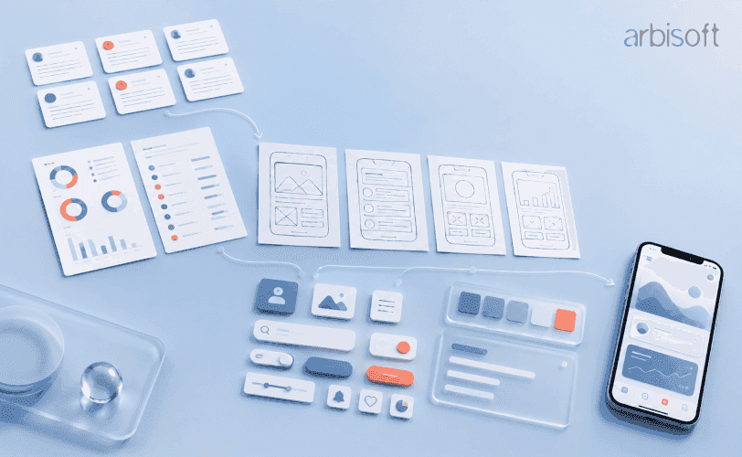
The complete mobile app design process starts with user research and continues through synthesis, information architecture, wireframing, prototyping, usability testing, visual design, accessibility, engineering handoff, production design QA, release sign-off, and production measurement.
Each stage should produce evidence and a decision before the next begins, so teams validate task structure and recovery paths before visual polish and prevent engineers from inventing missing behavior. Shared design tokens, components, states, accessibility requirements, and acceptance criteria should map clearly into code, while design QA and visual-regression checks confirm the built app matches the approved experience across devices and conditions.
After release, task completion, errors, abandonment, support feedback, and further testing should inform a recorded decision to iterate, investigate, monitor, or roll back. Small teams may combine activities, but the evidence should still exist.
Most mobile app design guides treat developer handoff as the finish line. A design-first process goes further. It starts with evidence about users, turns that evidence into structure and interaction decisions, validates those decisions before visual polish, and then protects them through implementation, release, and production measurement.
That broader scope matters because an approved design is not the same as a built product that matches it. The mobile app design process is complete only when the intended experience survives engineering trade-offs, device constraints, accessibility requirements, and real-world use.
Design-first and mobile-first solve different problems. Design-first means validated design intent leads the work and remains visible through release. Mobile-first is a responsive design principle that starts with the smallest screen and expands the experience for larger screens.
A design-first team can use a mobile-first layout strategy, but the terms are not interchangeable. Design-first governs how decisions move from discovery into production. Mobile-first governs how an interface adapts across screen sizes.
In practice, a design-first team tests task structure before visual styling, records the reasoning behind key decisions, and includes design review in the release process. It does not simply create polished screens before development begins.
The business case is about the timing of change, not aesthetics. A confusing label found in a wireframe can be corrected quickly. The same issue found after release may require design updates, code changes, regression testing, a new build, store review, and redeployment.
That does not mean every team needs a long, formal design phase. Lean teams can combine activities, narrow the research scope, or test one critical flow first. The important point is to make uncertainty visible before engineering absorbs it.
Useful proof that the process is reducing risk includes a research summary, an annotated user flow, a tested prototype, and a list of resolved usability issues. These artifacts show what the team learned and which decisions changed as a result.
User research establishes what people are trying to do, where they struggle, and what conditions shape their behavior. The input is a product decision or uncertainty that needs evidence. The deliverable is a set of findings that can support synthesis rather than a collection of interesting quotes.
Different methods answer different questions:
Qualitative and quantitative methods should complement each other. Analytics may show that users leave a flow at a particular step. Interviews or session review can help explain what made that step confusing. Neither type of evidence is automatically stronger. The right method depends on the decision.
Avoid rigid rules about participant counts or research duration. Exploratory qualitative work can produce useful patterns with a small number of well-chosen participants, while quantitative benchmarking requires a larger sample. Method fit matters more than copying a generic number.
Before synthesis begins, look for recurring evidence across more than one participant, channel, or method. One interview can reveal a possibility. Repetition turns that possibility into a stronger design input.
Raw notes do not become useful merely because they have been collected. Synthesis turns observations into patterns that can guide scope, structure, and priority. It starts with interview transcripts, survey responses, analytics, and field notes, then produces distinct artifacts with distinct jobs.
A persona is a research-based representation of a target user pattern. It should describe goals, behaviors, constraints, and context, not simply age, job title, or location. A persona built only from internal assumptions is a proto-persona, not validated evidence.
A user story converts a need into a compact statement of intent, such as: “As a returning customer, I want to resume an incomplete application so that I do not repeat work.” User stories help product and engineering teams understand what capability is needed and why.
A journey map shows the stages, actions, thoughts, and friction a persona experiences while pursuing a goal. It helps the team see where problems occur across the full experience, not only within one screen.
Contradictory findings should not be smoothed away. They may indicate a secondary persona, an edge case, or a condition that changes behavior. The synthesis is ready to guide information architecture when each important theme can be traced back to observed evidence and when the team agrees which user goals the product will support.
Information architecture, or IA, organizes content and functionality so people can find and understand what they need. A user flow maps the steps, decisions, and system states involved in completing a task.
The difference is practical. Information architecture answers, “What exists, and how is it grouped?” A user flow answers, “What happens after the user acts?”
Personas identify who is moving through the product. User stories identify the goal. Journey maps reveal likely friction. Those inputs should shape the content hierarchy, labels, navigation, and paths before anyone draws a screen.
Flow diagrams should include more than the successful path. Account creation, for example, may also require permission requests, validation errors, interrupted sessions, duplicate accounts, locked states, and recovery options. Mapping these branches early exposes missing decisions that would otherwise be pushed into development.
Card sorting and tree testing can help check whether labels and grouping match user expectations. Reviews with product, design, and engineering can reveal missing states or technical assumptions. The gate into wireframing is reached when the main tasks, branches, and recovery paths are explicit enough that a designer does not have to invent them screen by screen.
Mapping flows and hierarchy before design begins? Explore how our UX/UI design services connect information architecture, wireframing, interactive prototyping, usability testing, and design-system components.
A wireframe is an unstyled layout that resolves content priority, hierarchy, navigation, and screen structure. It takes the approved information architecture and user flows as input and produces a screen-level blueprint.
Low-fidelity wireframes use simple boxes, labels, and rough placement. Mid-fidelity wireframes add realistic content, spacing, and stronger layout detail while remaining visually restrained. The goal is not to make the interface attractive. The goal is to make its structure understandable and testable.
Keeping wireframes visually plain protects the quality of feedback. Polished screens often draw attention toward color, imagery, and taste. An unfinished-looking wireframe makes it easier to discuss whether the right information appears, whether actions are clear, and whether the hierarchy supports the task.
Use realistic content where possible. Placeholder text can hide problems with long labels, empty states, validation messages, and variable data. Review every wireframe against the full user flow, including error and recovery screens. Move forward when each important branch has a corresponding screen and the structure can be explained without relying on visual styling.
Static screens become a prototype when they are connected into an interactive, testable flow. The prototype takes approved wireframes as input and adds navigation, transitions, system responses, and enough behavior to support realistic tasks.
A wireframe answers what belongs on a screen. A prototype answers what happens when someone taps, swipes, submits, cancels, or encounters an error.
Fidelity should match the question. A low-fidelity prototype may be sufficient to test whether users can find a feature or complete a sequence. A higher-fidelity prototype may be needed to evaluate motion, gesture behavior, or a complex transition. More polish is not automatically more useful.
Prototypes can reveal comprehension problems, weak navigation, unclear feedback, and broken task logic before code exists. They cannot prove engineering feasibility, production performance, network behavior, or backend reliability. Those questions require technical validation and a working build.
Prepare the prototype around task scenarios, not a guided tour. Include key branches, errors, and recovery paths so participants can make real choices. The gate into usability testing is reached when the prototype represents the flow being evaluated rather than only the ideal path.
Usability testing should happen on wireframes and prototypes before visual design is finalized. This sequencing keeps structural problems cheap to change and prevents visual work from being built on an untested flow.
The input is a prototype plus a test plan. The output is a prioritized set of findings and a revised prototype. A useful plan identifies the participant characteristics that matter, the tasks they will attempt, the facilitation approach, and the evidence that counts as success, hesitation, error, or failure.
Tasks should be realistic and neutral. “Find a way to change your delivery address” produces better evidence than “Tap Account, then tap Address.” The facilitator should avoid teaching the interface during the task, because help can hide the exact point where the design breaks down.
Look for repeated behavior. Several participants struggling at the same step suggests a design problem. One participant expressing a personal preference may still be useful, but it is not enough by itself to justify a redesign.
The loop is simple: test, identify recurring friction, revise, and test again with fresh participants. Teams with limited time can focus on the highest-risk flow or run smaller rounds. What they should not do is treat visual polish as a substitute for structural validation.
Do not move into visual design while major navigation, comprehension, or recovery issues remain unresolved. The progression decision should be tied to evidence that representative users can complete the core tasks without repeated avoidable friction.
Visual design applies color, typography, iconography, imagery, spacing, and layout to a structure that has already been tested. Its input is the revised prototype. Its deliverable is a set of finished screens supported by a reusable design system.
A design system is a shared framework of principles, patterns, components, and guidelines used across design and engineering. A style guide may document visual rules. A component library may contain reusable interface elements. A design system connects those assets to usage rules and product behavior.
Design tokens are named values for decisions such as color, spacing, typography, radius, or elevation. Instead of copying a specific blue value into dozens of files, the team uses a token such as color-action-primary. Updating the token changes every place that references it.
Components combine tokens with structure and behavior. A button component, for example, needs more than a default appearance. It may require pressed, focused, disabled, loading, error, and long-label states. Form fields, cards, navigation elements, and dialogs need the same level of state coverage.
Before handoff, audit the system for duplicate components, undocumented one-off styles, missing states, and inconsistent token use. Check that accessibility constraints are built into the component definitions rather than left to individual screens. The design is ready for engineering when recurring patterns use shared components, the tokens are named consistently, and exceptions are documented.
Accessibility belongs inside every earlier stage, but it becomes especially concrete in flows, components, and acceptance criteria. The Web Content Accessibility Guidelines, or WCAG, provide testable guidance for making digital content more accessible to people with disabilities. Native platform guidance adds mobile-specific implementation detail.
Designers should address contrast, text scaling, touch target size, focus order, labels, motion, and non-text alternatives while screens and components are being defined. These are not finishing touches. They affect layout, hierarchy, component behavior, and task completion.
Accessibility requirements should be visible in the same artifacts the team already uses:
Verification requires more than an automated scan. Automated checks can find some issues, but manual review and assistive-technology testing are needed for focus order, labels, interaction behavior, and task completion. WCAG alignment improves accessibility, but it does not automatically establish legal compliance in every jurisdiction.
The gate into handoff is reached when accessibility requirements are embedded in the designs, components, and acceptance criteria. They should not exist as a separate audit planned after development.
Design handoff is the structured transfer of design intent into implementation. It is not a file drop. The input is the finished visual design, design system, prototype, and accessibility requirements. The deliverable is a complete, reviewable implementation package.
A strong handoff package includes:
Inspectable design files can reduce the need for manually drawn redlines, but tools do not remove ambiguity on their own. Naming, versioning, and shared understanding still matter. A short walkthrough between design and engineering should confirm component mappings, token names, state coverage, content behavior, and known constraints before implementation begins.
Where possible, a design component should map to a corresponding engineering component, and a design token should map to a named variable in code. This parity reduces ad hoc values and makes future changes easier to govern.
The handoff is ready when engineering can implement each screen and state without inventing missing behavior. Questions will still arise, so the process also needs a channel for clarification and a clear owner for design decisions.
Ready to build the design you already validated? See our mobile app development services, which implement design tokens, component states, edge cases, accessibility criteria, and release QA.
This is where many design processes stop too early. Once development begins, design intent can degrade through missing states, one-off code values, rushed compromises, or skipped review. Production UX is the discipline of checking and protecting the experience inside the built product.
Design quality assurance, or design QA, compares the built app with the approved design. Functional QA asks whether a feature works. Design QA asks whether the implemented layout, components, states, interactions, motion, and accessibility behavior match the intended experience.
A practical design QA review should cover the app screen by screen and state by state. It should include different device sizes, content lengths, error conditions, loading states, and accessibility behavior. Reviewing only a default screenshot leaves most of the experience unverified.
A design that was approved is not evidence that the build matches it.
Token and component parity provide stronger control. If design uses a token named space-medium, code should reference the corresponding variable rather than a hard-coded value. If design uses a shared input component, engineering should implement a shared counterpart with the same documented states. The goal is not identical tooling. It is a traceable relationship between the design system and the production system.
Visual-regression testing adds automated screenshot comparison. It can flag unexpected changes in spacing, typography, layout, and component appearance. It cannot judge whether a new design is correct, whether focus order works, or whether an interaction is understandable. Dynamic content may also create false positives. Visual-regression testing supports manual design QA rather than replacing it.
Teams need a clear way to triage deviations. A minor spacing issue is different from a missing error state or an accessibility failure. Each issue should have an owner, severity, decision, and resolution record. Approved exceptions should include a reason rather than disappearing into informal messages.
Design sign-off should be part of the release gate. Before approval, the team should confirm that required states exist, serious design defects are resolved, accepted deviations are documented, accessibility behavior has been checked, and the visual-regression baseline is current.
The evidence package for production parity is therefore broader than a screenshot. It includes the design QA log, token and component checks, regression results, and recorded sign-off. Those controls distinguish a product that resembles the design from one that demonstrably implements it.
Release introduces evidence that prototypes cannot provide. Production measurement checks whether real behavior supports or challenges the design decisions made earlier.
The input is a shipped feature tied to a clear design hypothesis. The deliverable is a review record linking observed signals to a decision, such as iterate, investigate, monitor, or roll back.
Useful UX metrics answer a product question. Task completion can evaluate whether a redesigned flow helps users finish. Error rate can reveal a weak step. Abandonment can show where progress breaks down. Raw sessions and screen views may describe activity, but they do not explain whether the experience works.
Quantitative and qualitative evidence should be combined. Funnel data can show where users leave. Session review, support tickets, app reviews, and follow-up usability testing can help explain why. Each channel has limits, so decisions should not rest on one signal alone.
A/B testing can compare two variants when the team has a clear hypothesis, enough traffic, a planned outcome measure, and control over competing changes. It is less useful for low-traffic features or questions that require rich explanation. Observational analytics can identify patterns, but they do not establish causation by themselves.
Record the design decision, the metric, the result, the interpretation, and the action taken. Sustained negative signals tied to a specific design choice should trigger renewed investigation or iteration.
How long does mobile app design take?
Duration depends on scope, platform count, research depth, accessibility requirements, design-system maturity, and the number of testing rounds. A useful estimate requires those inputs. A universal timeline would be misleading.
How much does mobile app design cost?
Cost depends on the same factors that shape effort: research, complexity, number of flows and states, platform coverage, testing, accessibility, and design-system work. A fixed figure without scope is not useful.
What is the difference between a wireframe and a prototype?
A wireframe is a static, unstyled layout of a screen. A prototype connects screens into an interactive flow so people can test navigation, transitions, feedback, and task completion.
What is the difference between design-first and mobile-first?
Design-first is a process discipline that carries validated design intent from research through release. Mobile-first is a layout strategy that starts with the smallest screen and expands for larger screens.
What is the difference between UX design and UI design?
UX design shapes how the product works, the research, structure, flows, and interactions that let people complete a task. UI design shapes how it looks and feels, the visual layer of color, typography, iconography, and components applied to that structure. This guide treats them as sequential: UX decisions are tested first, then UI is applied to a structure that already works.
Use these gates to confirm that each stage has produced evidence and a decision before the next begins.
Small teams may combine roles or compress activities, but the evidence should still exist. The sequence reduces avoidable rework and protects design intent. It does not guarantee product success.
...Loading Related Blogs
Trusted by top platforms for our transformative solutions and exceptional results: